
Page 123 - Excel Data Analysis
P. 123
07 537547 Ch06.qxd 3/4/03 12:09 PM Page 109
CHARTING DATA 6
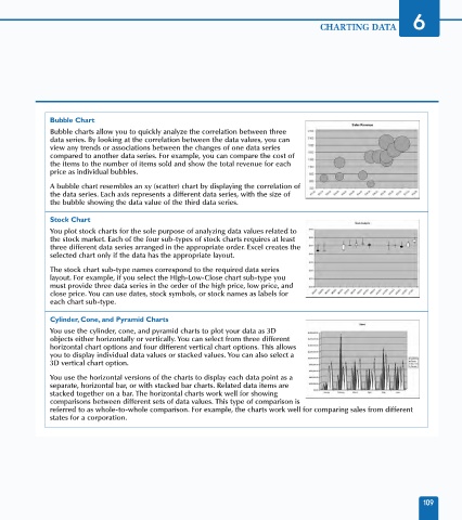
Bubble Chart
Bubble charts allow you to quickly analyze the correlation between three
data series. By looking at the correlation between the data values, you can
view any trends or associations between the changes of one data series
compared to another data series. For example, you can compare the cost of
the items to the number of items sold and show the total revenue for each
price as individual bubbles.
A bubble chart resembles an xy (scatter) chart by displaying the correlation of
the data series. Each axis represents a different data series, with the size of
the bubble showing the data value of the third data series.
Stock Chart
You plot stock charts for the sole purpose of analyzing data values related to
the stock market. Each of the four sub-types of stock charts requires at least
three different data series arranged in the appropriate order. Excel creates the
selected chart only if the data has the appropriate layout.
The stock chart sub-type names correspond to the required data series
layout. For example, if you select the High-Low-Close chart sub-type you
must provide three data series in the order of the high price, low price, and
close price. You can use dates, stock symbols, or stock names as labels for
each chart sub-type.
Cylinder, Cone, and Pyramid Charts
You use the cylinder, cone, and pyramid charts to plot your data as 3D
objects either horizontally or vertically. You can select from three different
horizontal chart options and four different vertical chart options. This allows
you to display individual data values or stacked values. You can also select a
3D vertical chart option.
You use the horizontal versions of the charts to display each data point as a
separate, horizontal bar, or with stacked bar charts. Related data items are
stacked together on a bar. The horizontal charts work well for showing
comparisons between different sets of data values. This type of comparison is
referred to as whole-to-whole comparison. For example, the charts work well for comparing sales from different
states for a corporation.
109