
Page 121 - Excel Data Analysis
P. 121
07 537547 Ch06.qxd 3/4/03 12:09 PM Page 107
CHARTING DATA 6
Line Chart (continued)
You can select from seven different sub-types of line charts, with or without data markers. You can also select from
line charts that display individual values or stacked line charts where the top line illustrates the total of each data
series. The line chart also provides a 3D line option, but you should be careful about using this sub-type with a
chart that displays several data series. Although 3D charts look more impressive, a user may find them distracting
and more difficult to interpret especially if your chart contains more than two data series lines.
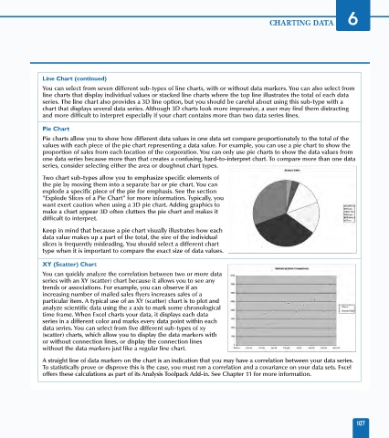
Pie Chart
Pie charts allow you to show how different data values in one data set compare proportionately to the total of the
values with each piece of the pie chart representing a data value. For example, you can use a pie chart to show the
proportion of sales from each location of the corporation. You can only use pie charts to show the data values from
one data series because more than that creates a confusing, hard-to-interpret chart. To compare more than one data
series, consider selecting either the area or doughnut chart types.
Two chart sub-types allow you to emphasize specific elements of
the pie by moving them into a separate bar or pie chart. You can
explode a specific piece of the pie for emphasis. See the section
"Explode Slices of a Pie Chart" for more information. Typically, you
want exert caution when using a 3D pie chart. Adding graphics to
make a chart appear 3D often clutters the pie chart and makes it
difficult to interpret.
Keep in mind that because a pie chart visually illustrates how each
data value makes up a part of the total, the size of the individual
slices is frequently misleading. You should select a different chart
type when it is important to compare the exact size of data values.
XY (Scatter) Chart
You can quickly analyze the correlation between two or more data
series with an XY (scatter) chart because it allows you to see any
trends or associations. For example, you can observe if an
increasing number of mailed sales flyers increases sales of a
particular item. A typical use of an XY (scatter) chart is to plot and
analyze scientific data using the x axis to mark some chronological
time frame. When Excel charts your data, it displays each data
series in a different color and marks every data point within each
data series. You can select from five different sub-types of xy
(scatter) charts, which allow you to display the data markers with
or without connection lines, or display the connection lines
without the data markers just like a regular line chart.
A straight line of data markers on the chart is an indication that you may have a correlation between your data series.
To statistically prove or disprove this is the case, you must run a correlation and a covariance on your data sets. Excel
offers these calculations as part of its Analysis Toolpack Add-in. See Chapter 11 for more information.
107