
Page 238 - Excel Progamming Weekend Crash Course
P. 238
n540629 ch17.qxd 9/2/03 9:35 AM Page 213
Session 17 — Introduction to Charts 213
There’s no rule that says data series must be in rows and categories in columns. The same
data from Figure 17-3 could just as well be plotted the other way, with each column repre-
senting a data series and each row a category. The important thing is that you know how
your data is arranged when creating a chart from it.
To specify the data for a chart, call the Chart object’s SetSourceData method. The syn-
tax is:
SetSourceData(Source, PlotBy)
Source is the worksheet range that contains the data. You can refer to it by row and col-
umn identifiers, or as a named range if a name has been assigned to the range. PlotBy is a
constant specifying whether the data series are in the rows of the range (xlRows) or the
columns of the range (xlColumns). Using the worksheet data in Figure 17-3 as an example,
the code to set the source data for a chart would be as follows (assuming that ch is a refer-
ence to a Chart object):
ch.SetSourceData Source:=Worksheets(“Sheet1”).Range(“B3:F6”),
PlotBy:=xlRows
Combining this with the other required code, Listing 17-1 shows a procedure to create an
embedded chart based on the data in Figure 17-3. The resulting chart is shown in Figure 17-4.
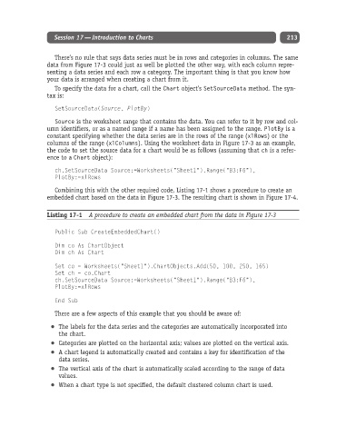
Listing 17-1 A procedure to create an embedded chart from the data in Figure 17-3
Public Sub CreateEmbeddedChart()
Dim co As ChartObject
Dim ch As Chart
Set co = Worksheets(“Sheet1”).ChartObjects.Add(50, 100, 250, 165)
Set ch = co.Chart
ch.SetSourceData Source:=Worksheets(“Sheet1”).Range(“B3:F6”),
PlotBy:=xlRows
End Sub
There are a few aspects of this example that you should be aware of:
The labels for the data series and the categories are automatically incorporated into
the chart.
Categories are plotted on the horizontal axis; values are plotted on the vertical axis.
A chart legend is automatically created and contains a key for identification of the
data series.
The vertical axis of the chart is automatically scaled according to the range of data
values.
When a chart type is not specified, the default clustered column chart is used.