
Page 256 - Excel Progamming Weekend Crash Course
P. 256
n540629 ch18.qxd 9/2/03 9:35 AM Page 231
Session 18 — Advanced Charting Techniques 231
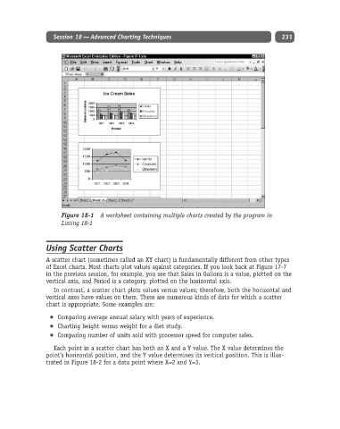
Figure 18-1 A worksheet containing multiple charts created by the program in
Listing 18-1
Using Scatter Charts
A scatter chart (sometimes called an XY chart) is fundamentally different from other types
of Excel charts. Most charts plot values against categories. If you look back at Figure 17-7
in the previous session, for example, you see that Sales in Gallons is a value, plotted on the
vertical axis, and Period is a category, plotted on the horizontal axis.
In contrast, a scatter chart plots values versus values; therefore, both the horizontal and
vertical axes have values on them. There are numerous kinds of data for which a scatter
chart is appropriate. Some examples are:
Comparing average annual salary with years of experience.
Charting height versus weight for a diet study.
Comparing number of units sold with processor speed for computer sales.
Each point in a scatter chart has both an X and a Y value. The X value determines the
point’s horizontal position, and the Y value determines its vertical position. This is illus-
trated in Figure 18-2 for a data point where X=2 and Y=3.