
Page 259 - Excel Progamming Weekend Crash Course
P. 259
n540629 ch18.qxd 9/2/03 9:35 AM Page 234
234 Saturday Evening
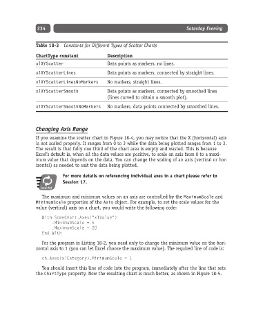
Table 18-3 Constants for Different Types of Scatter Charts
ChartType constant Description
xlXYScatter Data points as markers, no lines.
xlXYScatterLines Data points as markers, connected by straight lines.
xlXYScatterLinesNoMarkers No markers, straight lines.
xlXYScatterSmooth Data points as markers, connected by smoothed lines
(lines curved to obtain a smooth plot).
xlXYScatterSmoothNoMarkers No markers, data points connected by smoothed lines.
Changing Axis Range
If you examine the scatter chart in Figure 18-4, you may notice that the X (horizontal) axis
is not scaled properly. It ranges from 0 to 3 while the data being plotted ranges from 1 to 3.
The result is that fully one third of the chart area is empty and wasted. This is because
Excel’s default is, when all the data values are positive, to scale an axis from 0 to a maxi-
mum value that depends on the data. You can change the scaling of an axis (vertical or hor-
izontal) as needed to suit the data being plotted.
For more details on referencing individual axes in a chart please refer to
Session 17.
Cross-Ref
The maximum and minimum values on an axis are controlled by the MaximumScale and
MinimumScale properties of the Axis object. For example, to set the scale values for the
value (vertical) axis on a chart, you would write the following code:
With SomeChart.Axes(“xlValue”)
.MinimumScale = 5
.MaximumScale = 20
End With
For the program in Listing 18-2, you need only to change the minimum value on the hori-
zontal axis to 1 (you can let Excel choose the maximum value). The required line of code is:
ch.Axes(xlCategory).MinimumScale = 1
You should insert this line of code into the program, immediately after the line that sets
the ChartType property. Now the resulting chart is much better, as shown in Figure 18-5.