
Page 258 - Excel Progamming Weekend Crash Course
P. 258
n540629 ch18.qxd 9/2/03 9:35 AM Page 233
Session 18 — Advanced Charting Techniques 233
Dim ch As Chart
Set co = Worksheets(“Sheet1”).ChartObjects.Add(50, 200, 250, 165)
Set ch = co.Chart
ch.SetSourceData Source:=Worksheets(“Sheet1”).Range(“B3:D10”),
PlotBy:=xlColumns
ch.ChartType = xlXYScatterLines
‘ Add a chart title.
ch.HasTitle = True
ch.ChartTitle.Text = Worksheets(“Sheet1”).Range(“A1”).Value
‘ Add a category axis title.
With ch.Axes(xlCategory)
.HasTitle = True
.AxisTitle.Text = “Processor Speed (GHz)”
End With
‘ Add a value axis title.
With ch.Axes(xlValue)
.HasTitle = True
.AxisTitle.Text = “Units Sold”
End With
End Sub
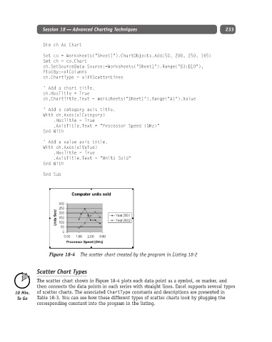
Figure 18-4 The scatter chart created by the program in Listing 18-2
Scatter Chart Types
The scatter chart shown in Figure 18-4 plots each data point as a symbol, or marker, and
then connects the data points in each series with straight lines. Excel supports several types
of scatter charts. The associated ChartType constants and descriptions are presented in
Table 18-3. You can see how these different types of scatter charts look by plugging the
corresponding constant into the program in the listing.