
Page 197 - Excel Workbook for Dummies
P. 197
20_798452 ch14.qxp 3/13/06 7:50 PM Page 180
180 Part III: Working with Graphics
Formatting Charts
Many times you find that you have to finesse the formatting of elements in the partic-
ular chart that the Chart Wizard produces for you. This is especially true in the case
of embedded charts, where the overall size of the Chart Area may make the fonts uses
in the titles, legend, and data labels too big in relation to the data markers in the plot
area.
You can change the formatting of a particular element in your chart in one of two ways:
Click the element in the chart to select it and then press Ctrl+1. Alternatively,
click the Format button on the Chart toolbar (the second one from the left) to
open the Format dialog box associated with that element.
Select the element to format with the Chart Objects drop-down list box in the
Chart toolbar and then click its Format button. Alternatively, press Ctrl+1 to
open the Format dialog box associated with that element.
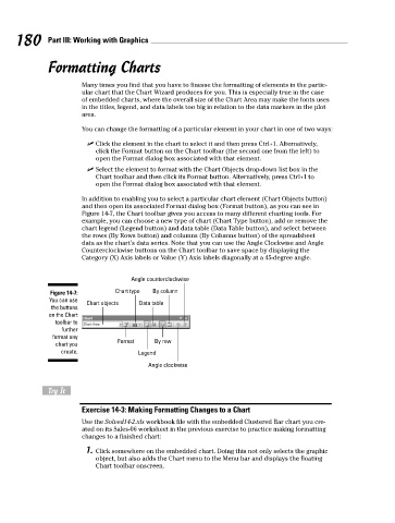
In addition to enabling you to select a particular chart element (Chart Objects button)
and then open its associated Format dialog box (Format button), as you can see in
Figure 14-7, the Chart toolbar gives you access to many different charting tools. For
example, you can choose a new type of chart (Chart Type button), add or remove the
chart legend (Legend button) and data table (Data Table button), and select between
the rows (By Rows button) and columns (By Columns button) of the spreadsheet
data as the chart’s data series. Note that you can use the Angle Clockwise and Angle
Counterclockwise buttons on the Chart toolbar to save space by displaying the
Category (X) Axis labels or Value (Y) Axis labels diagonally at a 45-degree angle.
Angle counterclockwise
Figure 14-7: Chart type By column
You can use
Chart objects Data table
the buttons
on the Chart
toolbar to
further
format any
Format By row
chart you
create. Legend
Angle clockwise
Try It
Exercise 14-3: Making Formatting Changes to a Chart
Use the Solved14-2.xls workbook file with the embedded Clustered Bar chart you cre-
ated on its Sales-06 worksheet in the previous exercise to practice making formatting
changes to a finished chart:
1. Click somewhere on the embedded chart. Doing this not only selects the graphic
object, but also adds the Chart menu to the Menu bar and displays the floating
Chart toolbar onscreen.