
Page 195 - Excel Workbook for Dummies
P. 195
20_798452 ch14.qxp 3/13/06 7:49 PM Page 178
178 Part III: Working with Graphics
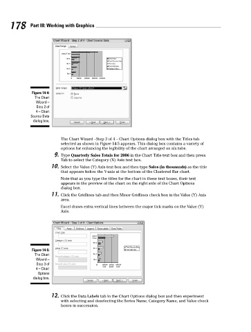
Figure 14-4:
The Chart
Wizard –
Step 2 of
4 – Chart
Source Data
dialog box.
The Chart Wizard –Step 3 of 4 – Chart Options dialog box with the Titles tab
selected as shown in Figure 14-5 appears. This dialog box contains a variety of
options for enhancing the legibility of the chart arranged on six tabs.
9. Type Quarterly Sales Totals for 2006 in the Chart Title text box and then press
Tab to select the Category (X) Axis text box.
10. Select the Value (Y) Axis text box and then type Sales (in thousands) as the title
that appears below the Y-axis at the bottom of the Clustered Bar chart.
Note that as you type the titles for the chart in these text boxes, their text
appears in the preview of the chart on the right side of the Chart Options
dialog box.
11. Click the Gridlines tab and then Minor Gridlines check box in the Value (Y) Axis
area.
Excel draws extra vertical lines between the major tick marks on the Value (Y)
Axis.
Figure 14-5:
The Chart
Wizard –
Step 3 of
4 – Chart
Options
dialog box.
12. Click the Data Labels tab in the Chart Options dialog box and then experiment
with selecting and deselecting the Series Name, Category Name, and Value check
boxes in succession.