
Page 190 - Excel Workbook for Dummies
P. 190
20_798452 ch14.qxp 3/13/06 7:49 PM Page 173
Chapter 14: Charting Spreadsheet Data 173
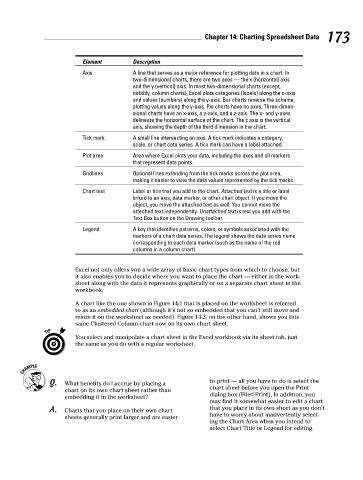
Element Description
Axis A line that serves as a major reference for plotting data in a chart. In
two-dimensional charts, there are two axes — the x (horizontal) axis
and the y (vertical) axis. In most two-dimensional charts (except,
notably, column charts), Excel plots categories (labels) along the x-axis
and values (numbers) along the y-axis. Bar charts reverse the scheme,
plotting values along the y-axis. Pie charts have no axes. Three-dimen-
sional charts have an x-axis, a y-axis, and a z-axis. The x- and y-axes
delineate the horizontal surface of the chart. The z axis is the vertical
axis, showing the depth of the third dimension in the chart.
Tick mark A small line intersecting an axis. A tick mark indicates a category,
scale, or chart data series. A tick mark can have a label attached.
Plot area Area where Excel plots your data, including the axes and all markers
that represent data points.
Gridlines Optional lines extending from the tick marks across the plot area,
making it easier to view the data values represented by the tick marks.
Chart text Label or title that you add to the chart. Attached text is a title or label
linked to an axis, data marker, or other chart object. If you move the
object, you move the attached text as well. You cannot move the
attached text independently. Unattached text is text you add with the
Text Box button on the Drawing toolbar.
Legend A key that identifies patterns, colors, or symbols associated with the
markers of a chart data series. The legend shows the data series name
corresponding to each data marker (such as the name of the red
columns in a column chart).
Excel not only offers you a wide array of basic chart types from which to choose, but
it also enables you to decide where you want to place the chart — either in the work-
sheet along with the data it represents graphically or on a separate chart sheet in the
workbook.
A chart like the one shown in Figure 14-1 that is placed on the worksheet is referred
to as an embedded chart (although it’s not so embedded that you can’t still move and
resize it on the worksheet as needed). Figure 14-2, on the other hand, shows you this
same Clustered Column chart now on its own chart sheet.
You select and manipulate a chart sheet in the Excel workbook via its sheet tab, just
the same as you do with a regular worksheet.
Q. What benefits do I accrue by placing a to print — all you have to do is select the
chart on its own chart sheet rather than chart sheet before you open the Print
embedding it in the worksheet? dialog box (File➪Print). In addition, you
may find it somewhat easier to edit a chart
A. Charts that you place on their own chart that you place in its own sheet as you don’t
sheets generally print larger and are easier have to worry about inadvertently select-
ing the Chart Area when you intend to
select Chart Title or Legend for editing.