
Page 386 - Laboratory Manual in Physical Geology
P. 386
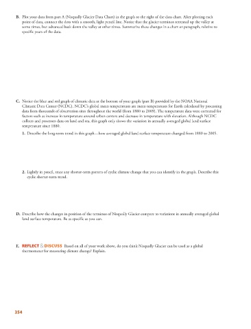
B.   Plot your data from part A (Nisqually Glacier Data Chart) in the graph to the right of the data chart. After plotting each

            point of data, connect the dots with a smooth, light pencil line. Notice that the glacier terminus retreated up the valley at
            some times, but advanced back down the valley at other times. Summarize these changes in a chart or paragraph, relative to
            specific years of the data.


           C.   Notice the blue and red graph of climatic data at the bottom of your graph (part B) provided by the NOAA National


            Climatic Data Center (NCDC). NCDC’s global mean temperatures are mean temperatures for Earth calculated by processing
            data from thousands of observation sites throughout the world (from 1880 to 2009). The temperature data were corrected for
            factors such as increase in temperature around urban centers and decrease in temperature with elevation. Although NCDC
            collects and processes data on land and sea, this graph only shows the variation in annually averaged global land surface
            temperature since 1880.

                1.   Describe the long-term trend in this graph—how averaged global land surface temperature changed from 1880 to 2005.


               2.   Lightly in pencil, trace any shorter-term pattern of cyclic climate change that you can identify in the graph. Describe this

              cyclic shorter-term trend.


           D.   Describe how the changes in position of the terminus of Nisqually Glacier compare to variations in annually averaged global

            land surface temperature. Be as specific as you can.


           E.       REFLECT & DISCUSS   Based on all of your work above, do you think Nisqually Glacier can be used as a global
            thermometer for measuring climate change? Explain.


        354