
Page 220 -
P. 220
10 Understanding Simulation Results 217
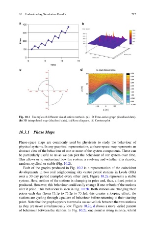
Fig. 10.1 Examples of different visualisation methods. (a) 1D Time-series graph (idealised data).
(b) 3D interpolated map (idealised data). (c) Rose diagram. (d) Contour plot
10.3.1 Phase Maps
Phase-space maps are commonly used by physicists to study the behaviour of
physical systems. In any graphical representation, a phase-space map represents an
abstract view of the behaviour of one or more of the system components. These can
be particularly useful to us as we can plot the behaviour of our system over time.
This allows us to understand how the system is evolving and whether it is chaotic,
random, cyclical or stable (Fig. 10.2).
Each of the graphs produced in Fig. 10.2 is a representation of the coincident
developments in two real neighbouring city centre petrol stations in Leeds (UK)
over a 30-day period (sampled every other day). Figure 10.2a represents a stable
system. Here, neither of the stations is changing in price and, thus, a fixed point is
produced. However, this behaviour could easily change if one or both of the stations
alter it price. This behaviour is seen in Fig. 10.2b. Both stations are changing their
prices each day (from 75.1p to 75.2p to 75.1p); this creates a looping effect; the
stations are cycling through a pattern of behaviour before returning to their starting
point. Note that the graph appears to reveal a causative link between the two stations
as they are never simultaneously low. Figure 10.2c, d shows a more varied pattern
of behaviour between the stations. In Fig. 10.2c, one point is rising in price, whilst