
Page 222 -
P. 222
10 Understanding Simulation Results 219
a 40 60 80 100 b 80 85 90 95 100
1.00 1.00
100 0.900 100 0.900
0.800 0.800
0.700 0.700
95
80 0.600 0.600
0.500
0.500
Day 2 0.400 Day 2 90 0.400
60 0.300 0.300
0.200 85 0.200
0.100 0.100
0.00 0.00
40 80
40 60 80 100 80 85 90 95 100
Day 1 Day 1
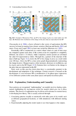
Fig. 10.3 Example of Recurrence Plots. (a) RP of the change in price at a retail outlet over 100
days. (b) illustrates how oscillations in the change in the price data are represented in the RP
(Vasconcelos et al. 2006), a factor reflected in the variety of applications that RPs
can now be found in ranging from climate variation (Marwan and Kruths 2002) and
music (Foote and Cooper 2001) to heart rate variability (Marwan et al. 2002).
Essentially a RP is constructed via a matrix where values at a pair of time steps
are compared against each other. If the system at the two snapshots is completely
different, the result is 1.0 (black), while completely similar periods are attributed
the value 0.0 (represented as white). Through this, a picture of the structure of the
data is built up. Figure 10.3a shows the RP of the change in price at a retail outlet
over 100 days. Above the RP is a time-series graph diagrammatically representing
the change in price. Changes in price, either increases, decreases or oscillations, can
be clearly seen in the RP. Figure 10.3b illustrates how oscillations in the change in
the price data are represented in the RP.
Early work on this area has shown that there is considerable potential in the
development and adaptation of this technique. Current research is focused on the
development of cross-reference RPs (consideration of the phase-space trajectories
of two different systems in the same phase space) and spatial recurrence plots.
10.4 Explanation, Understanding and Causality
Once patterns are recognised, “understanding” our models involves finding expla-
nations highlighting the mechanisms within the models which give rise to these
patterns. The process of explanation may be driven with reference to current theory
or developing new theory. This is usually achieved through:
1. Correlating patterns visually or statistically with other parts of the model, such
as different geographical locations, or with simulations with different starting
values.
2. Experimentally adjusting the model inputs to see what happens to the outputs.