
Page 336 - Six Sigma Demystified
P. 336
mYsTiFieD / Romero & Kemp / 000-0 / Chapter 3
316 six sigma DemystifieD
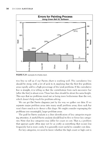
Figure F.24 Example of a Pareto chart.
tive line to tell us if our Pareto chart is working well. The cumulative line
should be steep, with a lot of arch to it, implying that the first few problem
areas rapidly add to a high percentage of the total problems. If the cumulative
line is straight, it is telling us that the contribution from each successive bar
(after the first) is about even. These bars then should be about the same height.
This says that no problems stand out as being more bothersome than the rest,
which doesn’t help much for problem solving.
We can get flat Pareto diagrams just by the way we gather our data. If we
separate major problem areas into many small problem areas, then each bar
won’t have much in it—hence a flat shape. We might consider regrouping the
problems into meaningful, larger problem areas.
The goal for Pareto analysis is a clear identification of key categories requir-
ing attention. A useful Pareto analysis should lead to five or fewer key catego-
ries. Note that key categories may differ for count or cost. That is, a problem
that appears quite often may not be as costly as something that occurs less
frequently but is more costly. It is generally most useful to consider cost data.
For key categories, we need to know whether the high count or high cost is