
Page 426 - Six Sigma Demystified
P. 426
406 Six SigMa DemystifieD
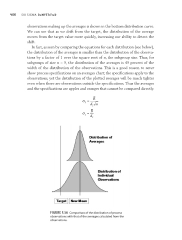
observations making up the averages is shown in the bottom distribution curve.
We can see that as we drift from the target, the distribution of the average
moves from the target value more quickly, increasing our ability to detect the
shift.
In fact, as seen by comparing the equations for each distribution (see below),
the distribution of the averages is smaller than the distribution of the observa-
tions by a factor of 1 over the square root of n, the subgroup size. Thus, for
subgroups of size n = 5, the distribution of the averages is 45 percent of the
width of the distribution of the observations. This is a good reason to never
show process specifications on an averages chart; the specifications apply to the
observations, yet the distribution of the plotted averages will be much tighter
even when there are observations outside the specifications. Thus the averages
and the specifications are apples and oranges that cannot be compared directly.
R
σ =
x
d n
2
R
σ =
x d
2
Figure F.56 Comparison of the distribution of process
observations with that of the averages calculated from the
observations.