Page 134 - Statistics II for Dummies
P. 134

118        Part II: Using Different Types of Regression to Make Predictions


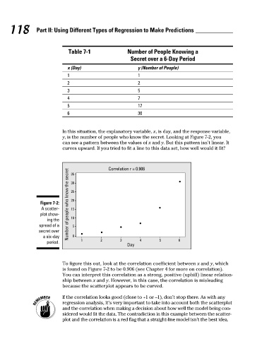
                                   Table 7-1              Number of People Knowing a
                                                           Secret over a 6-Day Period
                                  x (Day)                     y (Number of People)
                                  1                           1
                                  2                           2
                                  3                           5
                                  4                           7
                                  5                           17
                                  6                           30


                                In this situation, the explanatory variable, x, is day, and the response variable,
                                y, is the number of people who know the secret. Looking at Figure 7-2, you
                                can see a pattern between the values of x and y. But this pattern isn’t linear. It
                                curves upward. If you tried to fit a line to this data set, how well would it fit?


                                                  Correlation r = 0.906
                                  Number of people who know the secret
                                    35

                                    25

                                    20
                        Figure 7-2:   30
                        A scatter-  15
                        plot show-
                          ing the   10
                       spread of a   5
                       secret over
                         a six-day   0
                          period.       1      2       3  Day  4      5       6


                                To figure this out, look at the correlation coefficient between x and y, which
                                is found on Figure 7-2 to be 0.906 (see Chapter 4 for more on correlation).
                                You can interpret this correlation as a strong, positive (uphill) linear relation-
                                ship between x and y. However, in this case, the correlation is misleading
                                because the scatterplot appears to be curved.
                                If the correlation looks good (close to +1 or –1), don’t stop there. As with any
                                regression analysis, it’s very important to take into account both the scatterplot
                                and the correlation when making a decision about how well the model being con-
                                sidered would fit the data. The contradiction in this example between the scatter-
                                plot and the correlation is a red flag that a straight-line model isn’t the best idea.


          12_466469-ch07.indd   118                                                                   7/24/09   9:39:07 AM
   129   130   131   132   133   134   135   136   137   138   139