
Page 17 - Statistics for Environmental Engineers
P. 17
L1592_Frame_C02 Page 8 Tuesday, December 18, 2001 1:40 PM
Example 2.1
A laboratory’s measurement process was assessed by randomly inserting 27 specimens having
a known concentration of η = 8.0 mg/L into the normal flow of work over a period of 2 weeks.
A large number of measurements were being done routinely and any of several chemists might
be assigned any sample specimen. The chemists were ‘blind’ to the fact that performance was
being assessed. The ‘blind specimens’ were outwardly identical to all other specimens passing
through the laboratory. This arrangement means that observed values are random and independent.
The results in order of observation were 6.9, 7.8, 8.9, 5.2, 7.7, 9.6, 8.7, 6.7, 4.8, 8.0, 10.1, 8.5,
6.5, 9.2, 7.4, 6.3, 5.6, 7.3, 8.3, 7.2, 7.5, 6.1, 9.4, 5.4, 7.6, 8.1, and 7.9 mg/L.
The population is all specimens having a known concentration of 8.0 mg/L. The sample is
the 27 observations (measurements). The sample size is n = 27. The random variable is the
measured concentration in each specimen having a known concentration of 8.0 mg/L. Experi-
mental error has caused the observed values to vary about the true value of 8.0 mg/L. The errors
are 6.9 − 8.0 = −1.1, 7.8 − 8.0 = −0.2, +0.9, −2.8, −0.3, +1.6, +0.7, and so on.
Plotting the Data
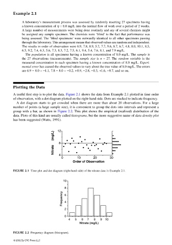
A useful first step is to plot the data. Figure 2.1 shows the data from Example 2.1 plotted in time order
of observation, with a dot diagram plotted on the right-hand side. Dots are stacked to indicate frequency.
A dot diagram starts to get crowded when there are more than about 20 observations. For a large
number of points (a large sample size), it is convenient to group the dots into intervals and represent a
group with a bar, as shown in Figure 2.2. This plot shows the empirical (realized) distribution of the
data. Plots of this kind are usually called histograms, but the more suggestive name of data density plot
has been suggested (Watts, 1991).
12
Nitrate (mg/L) 8 • •••
••••••
••••••••
•••••
•
4
0 10 20 30 •••
Order of Observation
FIGURE 2.1 Time plot and dot diagram (right-hand side) of the nitrate data in Example 2.1.
10
8
Frequency 6 4
2
0
4 5 6 7 8 9 10
Nitrate (mg/L)
FIGURE 2.2 Frequency diagram (histogram).
© 2002 By CRC Press LLC