
Page 335 -
P. 335
302 Part 4 • the essentials of Design
on which organizational members base their decisions is determined by what analysts perceive
is important to the business.
Bias is present in everything that humans create. This statement is not to judge bias as bad
but to make the point that it is inseparable from what we (and consequently our systems) pro-
duce. The concerns of systems analysts are to avoid unnecessarily biasing output and to make
users aware of the possible biases in the output they receive.
Presentations of output are unintentionally biased in three main ways:
1. How information is sorted
2. Setting of acceptable limits
3. Choice of graphics
inTrodUcing bias When inforMaTion is sorTed. Bias is introduced to output when analysts
and users make choices about how information is sorted for a report. Common sorts include
alphabetical, chronological, and cost.
Information presented alphabetically may overemphasize the items that begin with the let-
ters A and B because users tend to pay more attention to information presented first. For example,
if past suppliers are listed alphabetically, companies such as Aardvark Printers, Advent Supplies,
and Barkley Office Equipment are shown to the purchasing manager first. When certain airlines
created the SABRE and APOLLO reservations systems, they listed their own flights first, until
the other airlines complained that this type of sorting was biased.
inTrodUcing bias by seTTing liMiTs. A second major source of bias in output is the
predefinition of limits for particular values being reported. Many reports are generated on an
exception basis only, which means that when limits on values are set beforehand, only exceptions
to those values will be output. Exception reports make the decision maker aware of deviations
from satisfactory values.
For example, limits that are set too low for exception reports can bias the user’s percep-
tion. An insurance company that generates exception reports on all accounts one week overdue
has set too low a limit on overdue payments. The decision maker receiving the output will be
overwhelmed with “exceptions” that are not really cause for concern. The one-week overdue
exception report leads to the user’s misperception that there are a great many overdue accounts.
A more appropriate limit for generating an exception report would be accounts 30 days or more
overdue.
inTrodUcing bias ThroUgh graphics. Output is subject to a third type of presentation bias,
which is brought about by an analyst’s (or users’) choice of graphics for output display. Bias can
occur in the selection of the graph size, its color, the scale used, and even the type of graphic.
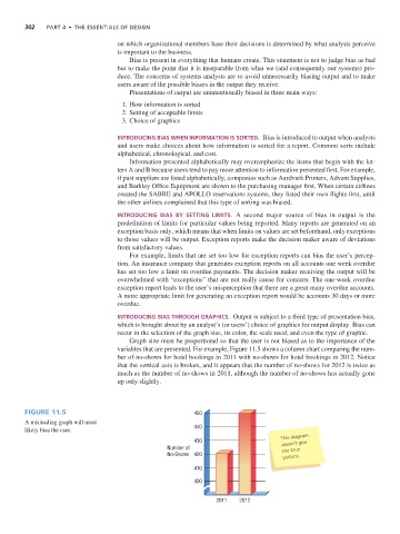
Graph size must be proportional so that the user is not biased as to the importance of the
variables that are presented. For example, Figure 11.5 shows a column chart comparing the num-
ber of no-shows for hotel bookings in 2011 with no-shows for hotel bookings in 2012. Notice
that the vertical axis is broken, and it appears that the number of no-shows for 2012 is twice as
much as the number of no-shows in 2011, although the number of no-shows has actually gone
up only slightly.
Figure 11.5 450
A misleading graph will most
likely bias the user. 440
This diagram
430 doesn’t give
Number of the true
No-Shows 420 picture.
410
400
2011 2012