
Page 339 -
P. 339
306 Part 4 • the essentials of Design
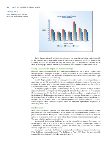
Figure 11.8
A bar chart display for onscreen
inspection of troop time response. Average Response Time per Troop Area
Nebraska State Patrol
50
45
40
35
30
Time (in
minutes) 25
20
15
10
5
0
HQ A B C D E State
Troop Area Workforce
Current Forecasted Minimum
Rather than crowding all retailer information onto one page, the analyst has made it possible
for the user to bring up a particular retailer if a problem or question arises. If, for example, the
summary indicates that an order was only partially shipped, the user can check further on the
order by calling up a detailed retailer display and then following up with appropriate action.
Using Graphical Output in Screen Design
Graphical output can be powerful. It is much easier to identify a trend or notice a pattern when
the right graph is displayed. Most people notice differences in graphs more easily than they
notice differences in tables. It is important to collaborate with users in choosing the correct style
of graph to communicate your meaning.
As with the presentation of tabular output, graphical output needs to be accurate and easy to
understand and use if it is to be effective in communicating information to users. Decision mak-
ers using the graphs need to know the assumptions (biases) under which the graphs are being
constructed so that they can adjust to or compensate for them.
In designing graphical output, a systems analyst and any users involved in design prototyp-
ing must determine (1) the purpose of the graph, (2) the kind of data that need to be displayed,
(3) its audience, and (4) the effects on the audience of different kinds of graphical output. In
the instance of a decision support system, the purposes of graphical displays are to support any
of the three phases of problem solving a user experiences: intelligence, design, or choice. An
example from the Nebraska State Patrol workforce planning DSS is shown in Figure 11.8. Here,
current response times, forecasted response times, and minimum requirements are graphed as
differently shaded bars.
Dashboards
Decision makers need output that helps them make decisions effectively and quickly. It helps
executives and other decision makers if all the information they need to make decisions is dis-
played in front of them. When given a written report, a decision maker would prefer all the infor-
mation to be contained in that one report rather than searching for information in other places.
The same principle applies to screen design.
A dashboard, similar to the dashboard in a car, has many different gauges. Each gauge can
display a graph (similar to the speed in miles or kilometers per hour), a problem light (similar to
a light showing that the automatic braking system is not functioning), or even text (like an odom-
eter that simply counts the miles traveled).
An executive can find a dashboard to be extremely useful in making decisions, but only
if the dashboard is designed properly. The dashboard in Figure 11.9 shows that a considerable
amount of information can be included on a single screen.