
Page 340 -
P. 340
ChaPter 11 • Designing effeCtive outPut 307
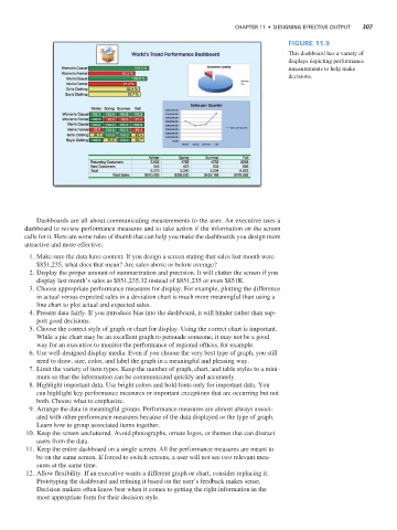
Figure 11.9
This dashboard has a variety of
displays depicting performance
measurements to help make
decisions.
Dashboards are all about communicating measurements to the user. An executive uses a
dashboard to review performance measures and to take action if the information on the screen
calls for it. Here are some rules of thumb that can help you make the dashboards you design more
attractive and more effective:
1. Make sure the data have context. If you design a screen stating that sales last month were
$851,235, what does that mean? Are sales above or below average?
2. Display the proper amount of summarization and precision. It will clutter the screen if you
display last month’s sales as $851,235.32 instead of $851,235 or even $851K.
3. Choose appropriate performance measures for display. For example, plotting the difference
in actual versus expected sales in a deviation chart is much more meaningful than using a
line chart to plot actual and expected sales.
4. Present data fairly. If you introduce bias into the dashboard, it will hinder rather than sup-
port good decisions.
5. Choose the correct style of graph or chart for display. Using the correct chart is important.
While a pie chart may be an excellent graph to persuade someone, it may not be a good
way for an executive to monitor the performance of regional offices, for example.
6. Use well-designed display media. Even if you choose the very best type of graph, you still
need to draw, size, color, and label the graph in a meaningful and pleasing way.
7. Limit the variety of item types. Keep the number of graph, chart, and table styles to a mini-
mum so that the information can be communicated quickly and accurately.
8. Highlight important data. Use bright colors and bold fonts only for important data. You
can highlight key performance measures or important exceptions that are occurring but not
both. Choose what to emphasize.
9. Arrange the data in meaningful groups. Performance measures are almost always associ-
ated with other performance measures because of the data displayed or the type of graph.
Learn how to group associated items together.
10. Keep the screen uncluttered. Avoid photographs, ornate logos, or themes that can distract
users from the data.
11. Keep the entire dashboard on a single screen. All the performance measures are meant to
be on the same screen. If forced to switch screens, a user will not see two relevant mea-
sures at the same time.
12. Allow flexibility. If an executive wants a different graph or chart, consider replacing it.
Prototyping the dashboard and refining it based on the user’s feedback makes sense.
Decision makers often know best when it comes to getting the right information in the
most appropriate form for their decision style.