
Page 162 - Excel Data Analysis
P. 162
09 537547 Ch08.qxd 3/4/03 12:06 PM Page 148
EXCEL DATA ANALYSIS
CHANGE THE CHART TYPE OF A PIVOTCHART
ou can use a different chart type with a PivotChart to You need to consider what types of data your specific chart
aid in emphasizing different values in your data type requires. For example, a Pie chart can display only one
Y analysis. For example, if you want to analyze sales for data series, so if your PivotChart contains multiple data
each state over a year, you probably want to select a line or series, not all data display on a Pie chart. To ensure that you
column chart. Whereas, if you want to compare sales within can use a specific chart type with your PivotChart, you
the state of Texas with the entire country, you want to should preview the new chart type from the Chart Type
select an area or pie chart. See Chapter 6 for more dialog box. When you preview the PivotChart, Excel creates
information about when to use different chart types to a sample chart using the data from your PivotChart.
show data analysis.
When you switch to a different chart type, by default Excel
If the default Stacked Column chart does not illustrate the maintains any specially applied formatting. For example, if
PivotChart fields as desired, you can change the chart type you have modified font types, colors, and so on, Excel
using the Chart Type dialog box. With the exceptions of XY applies those options to the new chart type. If you want to
(Scatter), Stock, or Bubble chart types, which Excel does not use the default formatting of the new chart type, you must
allow you to use, you can use almost any of the chart types select the Default formatting option.
and associated subtypes on your PivotCharts.
CHANGE THE CHART TYPE OF A PIVOTCHART
Bar
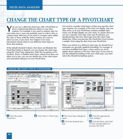
⁄ Click the entire ¤ Click Chart ➪ Chart Type. ■ The Chart Type dialog box › Click the appropriate
PivotChart. opens. chart subtype.
‹ Click the desired chart ˇ Click the Press and Hold
type. to View Sample option to
preview the chart.
148