
Page 133 - Excel Timesaving Techniques for Dummies
P. 133
25_574272 ch22.qxd 10/1/04 10:45 PM Page 118
118
Technique 22: Charting Data in a Snap
(In the column chart, these totals are represented
by the last data series — the tallest bars in each
monthly category.)
To prevent Excel from graphing the subtotals row, all
I needed to do was to select the cell range A2:J6
before I pressed F11. To eliminate this total data
series and have Excel redraw the chart without it, I
just click any one of the columns representing indi-
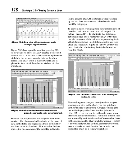
• Figure 22-1: Data table with production schedule vidual data points of this total data series and then
arranged by part number. press the Delete key. Figure 22-3 shows you the col-
umn chart after eliminating the totals data series
Figure 22-2 shows you the result of pressing F11. from the chart.
As you can see, Excel instantly creates a clustered
column chart on its own chart sheet using the rows
of data in the production schedule as the data
series. This chart sheet is named Chart1 and is
placed in front of all the other worksheets in the
workbook.
• Figure 22-3: Clustered column chart after deleting the
totals data series.
After making sure that you have just the data you
want represented in the chart, you can get down
to the business of enhancing it. Because Excel auto-
• Figure 22-2: Clustered column chart created from matically displays the Chart toolbar (shown in
production schedule on its own chart sheet. Figure 22-4), you can use its buttons to make many
of these chart improvements. For those options that
Because I didn’t preselect the range of data to be are not readily available from the Chart toolbar, look
graphed, Excel automatically selects all the rows of to the options on the Chart pull-down menu — which
data in the table and represents them as the differ- is automatically added to the Excel menu bar when-
ent data series in the chart. This includes the last ever you make a chart sheet active or select an
row — the one containing the monthly subtotals. embedded chart on a regular worksheet.