
Page 134 - Excel Timesaving Techniques for Dummies
P. 134
25_574272 ch22.qxd 10/1/04 10:45 PM Page 119
119
Chart Wizard Magic
Chart Type Angle Counterclockwise Figure 22-5 shows you the same chart as originally
shown in Figure 22-3 after changing the chart type
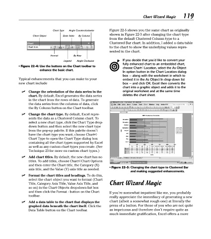
Chart Object Data Table By Column
from the default Clustered Column type to a
Clustered Bar chart. In addition, I added a data table
to the chart to show the underlying values repre-
sented in the chart.
Format By Row
Legend Angle Clockwise If you decide that you’d like to convert your
fully enhanced chart to an embedded chart,
• Figure 22-4: Use the buttons on the Chart toolbar to
choose Chart➪Location, select the As Object
enhance the basic chart.
In option button in the Chart Location dialog
box — along with the worksheet in which to
Typical enhancements that you can make to your embed it in the As Object In drop-down list
new chart include box — and click OK. Excel then converts the
chart into a graphic object and adds it to the
Change the orientation of the data series in the original worksheet and at the same time
chart. By default, Excel generates the data series deletes the chart sheet.
in the chart from the rows of data. To generate
the data series from the columns of data, click
the By Column button on the Chart toolbar.
Change the chart type. By default, Excel repre-
sents the data as a Clustered Column chart. To
select a new chart type, click the Chart Type drop-
down button and then select the new chart type
from the pop-up palette. If this palette doesn’t
have the chart type you want, choose Chart➪
Chart Type to open the Chart Type dialog box
containing all the chart types supported by Excel
as well as any custom chart types you create. (See
Technique 23 for more on custom chart types.)
Add chart titles. By default, the new chart has no
titles. To add titles, choose Chart➪Chart Options
and then enter the Chart title, the Category (X)
axis title, and the Value (Y) axis title as needed. • Figure 22-5: Changing the chart type to Clustered Bar
and making suggested enhancements.
Format the chart titles and headings. To do this,
select the chart object you want to format (Chart
Title, Category Axis Title, Value Axis Title, and Chart Wizard Magic
so on) in the Chart Objects drop-down list box
and then click the Format - button on the Chart If you’re somewhat impatient like me, you probably
toolbar. really appreciate the immediacy of generating a new
Add a data table to the chart that displays the chart (albeit a somewhat rough one) at literally the
graphed data beneath the chart itself. Click the press of a button. For those of you who are not quite
Data Table button on the Chart toolbar. as impetuous and therefore don’t require quite as
much immediate gratification, Excel offers a more