
Page 139 - Excel Timesaving Techniques for Dummies
P. 139
26_574272 ch23.qxd 10/1/04 10:28 PM Page 124
124
Technique 23: Chart Customization Tricks
Indeed, the only real answer to this problem is to
reduce the size of the chart text. The most efficient
way to make this kind of change is to follow these
steps:
1. Select a text element in the chart.
You can either do this by clicking the element in
the chart itself or by selecting its name on the
Chart Objects button’s drop-down list on the
Chart toolbar.
2. Click the Format button on the Chart toolbar.
Doing this opens a Format dialog box specifically
for the particular object.
3. Use the Size option on the Font tab of this dia-
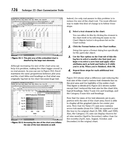
• Figure 23-1: This plot area of this embedded chart is
log box to select a smaller size font (and, per-
dwarfed by the large text elements.
haps even select a new font and apply other
attributes such as bold and italics to it while
Although increasing the size of the chart area can you’re at it). When you’re finished, click OK.
help this problem, making the chart bigger overall is
no real answer. As you can see in Figure 23-2, Excel 4. Repeat these steps for each additional text
maintains the same proportions between plot area element.
and the chart titles and headings so that what was
Figure 23-3 shows what a difference just reducing the
originally big text in the chart becomes huge text.
font size of the chart’s various text elements has on
the plot area and the legibility of the entire chart.
This figure is identical to Figure 22-2 shown earlier
except that I reduced the font size for the chart title,
legend headings, Value Y-axis title and headings, and
the Category X-axis title and headings.
Now that the sizes of the text elements are in pro-
portion with the size of the chart area, Excel is able
to display all the graphed data in the center plot
area. Note that the Value (Y) axis now contains
seven tick marks (from 0 to 1200) as opposed to just
the four in the original chart (0, 500, 1000, and 1500).
Also, the Category (X) axis can display clusters for
all nine months (April to December) rather than the
five months (April, June, August, October, and
December) in the original chart.
• Figure 23-2: Increasing the size of the chart area inflates
the size of the text elements as well.