
Page 140 - Excel Timesaving Techniques for Dummies
P. 140
26_574272 ch23.qxd 10/1/04 10:28 PM Page 125
125
Scaling and Formatting the Chart Axes
Very often, you’ll find that reducing the font size of
the Y-axis or X-axis headings is not enough; you may
also need to select a more truncated number format
for your numerical scales, Occasionally, you may
even find it beneficial to modify the scale that the
chart uses so that your worksheet data are better
represented in the plot area.
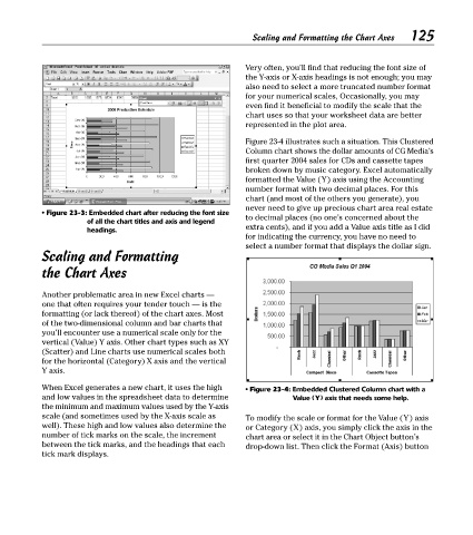
Figure 23-4 illustrates such a situation. This Clustered
Column chart shows the dollar amounts of CG Media’s
first quarter 2004 sales for CDs and cassette tapes
broken down by music category. Excel automatically
formatted the Value (Y) axis using the Accounting
number format with two decimal places. For this
chart (and most of the others you generate), you
never need to give up precious chart area real estate
• Figure 23-3: Embedded chart after reducing the font size
to decimal places (no one’s concerned about the
of all the chart titles and axis and legend
headings. extra cents), and if you add a Value axis title as I did
for indicating the currency, you have no need to
select a number format that displays the dollar sign.
Scaling and Formatting
the Chart Axes
Another problematic area in new Excel charts —
one that often requires your tender touch — is the
formatting (or lack thereof) of the chart axes. Most
of the two-dimensional column and bar charts that
you’ll encounter use a numerical scale only for the
vertical (Value) Y axis. Other chart types such as XY
(Scatter) and Line charts use numerical scales both
for the horizontal (Category) X axis and the vertical
Y axis.
When Excel generates a new chart, it uses the high • Figure 23-4: Embedded Clustered Column chart with a
and low values in the spreadsheet data to determine Value (Y) axis that needs some help.
the minimum and maximum values used by the Y-axis
scale (and sometimes used by the X-axis scale as To modify the scale or format for the Value (Y) axis
well). These high and low values also determine the or Category (X) axis, you simply click the axis in the
number of tick marks on the scale, the increment chart area or select it in the Chart Object button’s
between the tick marks, and the headings that each drop-down list. Then click the Format (Axis) button
tick mark displays.