
Page 143 - Excel Timesaving Techniques for Dummies
P. 143
26_574272 ch23.qxd 10/1/04 10:28 PM Page 128
128
Technique 23: Chart Customization Tricks
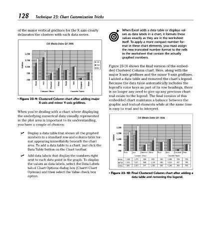
of the major vertical gridlines for the X axis clearly When Excel adds a data table or displays val-
delineates the clusters with each data series. ues as data labels in a chart, it formats these
values exactly as they are in the worksheet
itself. To apply a more compact number for-
mat in these chart elements, you must assign
the new truncated number format to the cells
in the worksheet that contain the actually
graphed numbers.
Figure 23-10 shows the final version of the embed-
ded Clustered Column chart. Here, along with the
major X-axis gridlines and the minor Y-axis gridlines,
I added a data table and removed the chart’s legend.
Because the data table automatically includes the
legend’s color keys as part of its row headings, there
is no longer any need to give up any precious chart
real estate to the legend. The final version of this
• Figure 23-9: Clustered Column chart after adding major embedded chart maintains a balance between the
X-axis and minor Y-axis gridlines.
graphic and textual elements while at the same time
is easy to read and to interpret.
When you’re dealing with a chart where displaying
the underlying numerical data visually represented
in the plot area is important to its understanding,
you have a couple of choices:
Display a data table that shows all the graphed
numbers in a standard row-and-column table for-
mat appearing immediately beneath the chart
area. To add a data table to a chart, just click the
Data Table button on the Chart toolbar.
Add data labels that display the numbers right
next to each data point in the graph. To display
the values as data labels, select the Data Labels
tab of Chart Options dialog box (Chart➪Chart
Options) and then select the Value check box • Figure 23-10: Final Clustered Column chart after adding a
option. data table and removing the legend.