
Page 141 - Excel Timesaving Techniques for Dummies
P. 141
26_574272 ch23.qxd 10/1/04 10:28 PM Page 126
126
Technique 23: Chart Customization Tricks
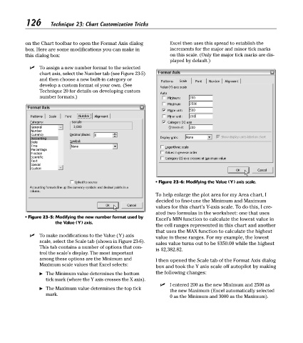
on the Chart toolbar to open the Format Axis dialog Excel then uses this spread to establish the
box. Here are some modifications you can make in increments for the major and minor tick marks
this dialog box: on this scale. (Only the major tick marks are dis-
played by default.)
To assign a new number format to the selected
chart axis, select the Number tab (see Figure 23-5)
and then choose a new built-in category or
develop a custom format of your own. (See
Technique 20 for details on developing custom
number formats.)
• Figure 23-6: Modifying the Value (Y) axis scale.
To help enlarge the plot area for my Area chart, I
decided to fine-tune the Minimum and Maximum
values for this chart’s Y-axis scale. To do this, I cre-
ated two formulas in the worksheet: one that uses
• Figure 23-5: Modifying the new number format used by Excel’s MIN function to calculate the lowest value in
the Value (Y) axis.
the cell ranges represented in this chart and another
that uses the MAX function to calculate the highest
To make modifications to the Value (Y) axis value in these ranges. For my example, the lowest
scale, select the Scale tab (shown in Figure 23-6). sales value turns out to be $350.00 while the highest
This tab contains a number of options that con- is $2,382.82.
trol the scale’s display. The most important
among these options are the Minimum and I then opened the Scale tab of the Format Axis dialog
Maximum scale values that Excel selects: box and took the Y axis scale off autopilot by making
The Minimum value determines the bottom the following changes:
tick mark (where the Y axis crosses the X axis).
I entered 200 as the new Minimum and 2500 as
The Maximum value determines the top tick
the new Maximum (Excel automatically selected
mark.
0 as the Minimum and 3000 as the Maximum).