
Page 142 - Excel Timesaving Techniques for Dummies
P. 142
26_574272 ch23.qxd 10/1/04 10:28 PM Page 127
Tricks for Making the Plotted Data Easier to Decipher
I increased the Minor Unit from Excel’s auto- For charts that use both an X-axis and a Y-axis, 127
matic increment of 100 up to 250. (The Minor sometimes the easiest thing you can do to improve
Unit determines where Excel draws tick marks the legibility of the chart is simply to add minor grid-
should you choose to display the minor gridlines lines. Depending upon the type of chart, these extra
for the Y axis.) lines can guide the eye from the tick marks displaying
the closest values on the Y-axis to the actual data
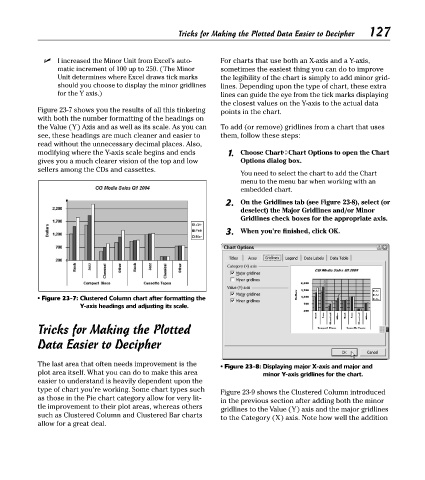
Figure 23-7 shows you the results of all this tinkering points in the chart.
with both the number formatting of the headings on
the Value (Y) Axis and as well as its scale. As you can To add (or remove) gridlines from a chart that uses
see, these headings are much cleaner and easier to them, follow these steps:
read without the unnecessary decimal places. Also,
modifying where the Y-axis scale begins and ends 1. Choose Chart➪Chart Options to open the Chart
gives you a much clearer vision of the top and low Options dialog box.
sellers among the CDs and cassettes.
You need to select the chart to add the Chart
menu to the menu bar when working with an
embedded chart.
2. On the Gridlines tab (see Figure 23-8), select (or
deselect) the Major Gridlines and/or Minor
Gridlines check boxes for the appropriate axis.
3. When you’re finished, click OK.
• Figure 23-7: Clustered Column chart after formatting the
Y-axis headings and adjusting its scale.
Tricks for Making the Plotted
Data Easier to Decipher
The last area that often needs improvement is the
• Figure 23-8: Displaying major X-axis and major and
plot area itself. What you can do to make this area minor Y-axis gridlines for the chart.
easier to understand is heavily dependent upon the
type of chart you’re working. Some chart types such
Figure 23-9 shows the Clustered Column introduced
as those in the Pie chart category allow for very lit-
in the previous section after adding both the minor
tle improvement to their plot areas, whereas others
gridlines to the Value (Y) axis and the major gridlines
such as Clustered Column and Clustered Bar charts
to the Category (X) axis. Note how well the addition
allow for a great deal.