
Page 55 - Geochemical Anomaly and Mineral Prospectivity Mapping in GIS
P. 55
54 Chapter 3
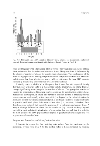
Fig. 3-3. Histogram and EDA graphics (density trace, jittered one-dimensional scatterplot,
boxplot) depicting the empirical density distribution of the soil Fe data in Fig. 3-1.
often used together with a histogram. That is because the visual impression one obtains
about univariate data behaviour and structure from a histogram alone is influenced by
the choice of number of classes for constructing a histogram. The combination of the
three EDA graphics with a histogram provides better insight to univariate data behaviour
and structure than from a histogram alone. Unlike a histogram, the three EDA graphics
can readily indicate any ‘abnormalities’ in a univariate data set.
A density trace is similar to a histogram, but it describes the empirical density
distribution of univariate data in a much more realistic manner and its shape does not
change significantly with change in the number of classes. The appropriate number of
classes for constructing a histogram can be controlled by constructing a jittered one-
dimensional scattergram, in which the univariate data are plotted at random positions
across a narrow band (usually with a range of 0-1) orthogonal to the univariate data axis.
Because a jittered one-dimensional scattergram is not based on classes of univariate data,
it provides additional pieces information about data (i.e., structure, behaviour, local
densities, gaps, outliers) that should be portrayed by a histogram and density trace. A
boxplot displays information about the characteristics (e.g., central tendency, spread,
etc.) of the empirical density distribution of a univariate data set, such that it is probably
the most useful of the EDA graphical tools applied in geochemical data analysis and so it
is given special attention here.
Boxplot and 5-number statistics of univariate data
A boxplot is created by first ordering data values from the minimum to the
maximum, or vice versa (Fig. 3-4). The median value is then determined by counting