
Page 264 - Introduction to Petroleum Engineering
P. 264
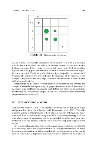
DECLINE CURVE ANALYSIS                                          251

                                   I =1    2       3      4

                            J =1


                               2


                               3


                               4


                             FIgURE 13.1  Illustration of a bubble map.


            area of interest. For example, cumulative oil production for a well at a particular
            point in time can be plotted as a circle (or bubble) centered on the well location
              displayed on a map. If this is done for several wells as in Figure 13.1, the resulting
            map will provide a graphic comparison of the relative amount of cumulative oil pro-
            duction at each well. The location of wells in the figure is specified in terms of the I,
            J indices. The radius of the circle indicates the magnitude of the variable. In our
            example, a large circle indicates large cumulative oil production relative to other
            wells with smaller circles.
              Bubble maps can be used to look for trends in the distribution of a variable. For
            example, if a small bubble representing the gas production rate at a well is surrounded
            by a set of large bubbles in an area, the small bubble may represent an anomalous
            measurement or a well that is damaged. In this case, a workover could increase the
            gas production rate at the well.


            13.2  DECLINE CURVE ANALYSIS

            Decline curve analysis (DCA) is an empirical technique for predicting oil or gas
            well production (Arps, 1945; Towler, 2002; Economides et al., 2013). The tech-
            nique fits a curve to measurements of flow rate as a function of time. Some reser-
            voirs, such as oil reservoirs with strong water influx, have enough energy to sustain
            relatively constant oil production rate for an extended period of time. As a rule,
            production flow rate declines with time once a well is completed and production
            begins.
              An exponential equation has been used to predict future production by fitting the
            exponential equation to historical decline rates for many production wells. Although
            the exponential equation provides a good fit of production rate as a function of
            time for some wells, a hyperbolic equation provides a better fit of the decline in