
Page 152 - Lean six sigma demystified
P. 152
Chapter 4 e xC e L Power Too LS for Lean Six Sigm a 131
Summarize Your Data with Pivot Tables
The QI Macros will draw graphs, but they won’t summarize your data auto-
matically because they cannot read your mind. However, you can use the
Pivot Table Wizard to summarize data in almost any conceivable way. For
example, what if you have a series of report codes from a computer system or
machine? You need to summarize them before you chart them. Just click on
1-to-4 column headings and Data Transformation-Pivot Table Wizard in the
QI Macros (or you can select the raw data and go to Excel’s menu bar and
choose Data–Pivot Table). With a little tinkering, you’ll learn how to summarize
your data any way you want it.
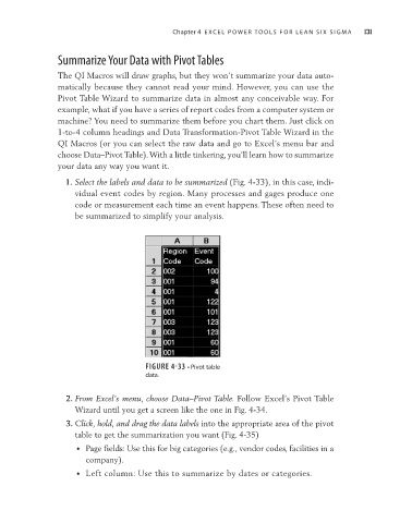
1. Select the labels and data to be summarized (Fig. 4-33), in this case, indi-
vidual event codes by region. Many processes and gages produce one
code or measurement each time an event happens. These often need to
be summarized to simplify your analysis.
FIGURE 4-33 • Pivot table
data.
2. From Excel’s menu, choose Data–Pivot Table. Follow Excel’s Pivot Table
Wizard until you get a screen like the one in Fig. 4-34.
3. Click, hold, and drag the data labels into the appropriate area of the pivot
table to get the summarization you want (Fig. 4-35)
• Page fields: Use this for big categories (e.g., vendor codes, facilities in a
company).
• Left column: Use this to summarize by dates or categories.