
Page 25 - Numerical Analysis Using MATLAB and Excel
P. 25
Chapter 1 Introduction to MATLAB
box off: This command removes the box (the solid lines which enclose the plot), and box on
restores the box. The command box toggles them. The default is on.
title(‘string’): This command adds a line of the text string (label) at the top of the plot.
y
x
xlabel(‘string’) and ylabel(‘string’) are used to label the − and −axis respectively.
x
The amplitude frequency response is usually represented with the −axis in a logarithmic scale.
We can use the semilogx(x,y) command that is similar to the plot(x,y) command, except that the
x −axis is represented as a log scale, and the −axis as a linear scale. Likewise, the semilogy(x,y)
y
command is similar to the plot(x,y) command, except that the −axis is represented as a log scale,
y
x
and the −axis as a linear scale. The loglog(x,y) command uses logarithmic scales for both axes.
Throughout this text, it will be understood that log is the common (base 10) logarithm, and ln is
the natural (base e) logarithm. We must remember, however, the function log(x) in MATLAB is
the natural logarithm, whereas the common logarithm is expressed as log10(x). Likewise, the loga-
rithm to the base 2 is expressed as log2(x).
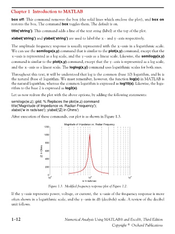
Let us now redraw the plot with the above options, by adding the following statements:
semilogx(w,z); grid; % Replaces the plot(w,z) command
title('Magnitude of Impedance vs. Radian Frequency');
xlabel('w in rads/sec'); ylabel('|Z| in Ohms')
After execution of these commands, our plot is as shown in Figure 1.3.
Magnitude of Impedance vs. Radian Frequency
1200
1000
800
|Z| in Ohms 600
400
200
0
2 3 4
10 10 10
w in rads/sec
Figure 1.3. Modified frequency response plot of Figure 1.2.
x
If the −axis represents power, voltage, or current, the −axis of the frequency response is more
y
often shown in a logarithmic scale, and the −axis in dB (decibels) scale. A review of the decibel
y
unit follows.
1−12 Numerical Analysis Using MATLAB® and Excel®, Third Edition
Copyright © Orchard Publications