
Page 213 - Pipeline Risk Management Manual Ideas, Techniques, and Resources
P. 213
8/190 Data Management and Analyses
Measures of variation as skewness and kurtosis can be performed to better define
aspects of the data set’s shape, there is really no substitute for a
Also called measures of dispersion, this class of measurements picture of the data.
tells us how the data organize themselves in relation to a central
point. Do they tend to clump together near a point of central Graphs and charts
tendency? Or, do they spread uniformly in either direction from
the central point? This section will highlight some common types of graphs and
The simplest method to define variation is with a calculation charts that help extract information from data sets. Experience
of the range. The range is the difference between the largest and will show what manner of picture is ultimately the most useful
smallest values of the data set. Used extensively in the 1920s for a particular data set, but a good place to start is almost
(calculations being done by hand) as an easy approximation for always the histogram.
variation, the range is still widely used in creating statistical
control charts. Histograms
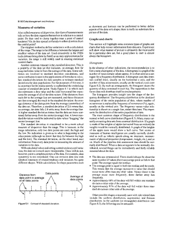
Another common measure is the standard deviation. Ths is
a property of the data set that indicates, on average, how far In the absence of other indications, the recommendation is to
away each data value is from the average of the data. Some sub- first create a histogram of the data. A histogram is a graph of the
tleties are involved in standard deviation calculations, and number of times certain values appear. It is often used as a sur-
some confusion is seen in the applications of formulas to calcu- rogate for a frequency distribution. A histogram uses data inter-
late standard deviations for data samples or estimate standard vals (called bins), usually on the horizontal x axis, and the
deviations for data populations. For the purposes of this text, it number of data occurrences, usually on the verticaly axis (see
is important for the reader merely to understand the underlying Figure 8.2). By such an arrangement, the histogram shows the
concept of standard deviation. Study Figure 8.1 in which each quantity of data contained in each bin. The supposition is that
dot represents a data value and the solid horizontal line repre- future data will distribute itself in similarpatterns.
sents the average of all of the data values. If the &stances from The histogram provides insight into the shape of the fre-
each dot to the average line are measured, and these &stances quency distribution. The frequency distribution is the idealized
are then averaged, the result is the standard deviation: the aver- histogram of the entire population of data, where number of
age distance of the data points from the average (centerline) of occurrences is replaced by frequency of occurrence e?), again,
the data set. Therefore, a standard deviation of 2.8 means that, usually on the vertical axis. The frequency versus value rela-
on average, the data falls 2.8 units away from the average line. tionship is shown as a single line, rather than bars. This repre-
A higher standard deviation means that the data are more scat- sents the distribution of the entire population of data.
tered, farther away from the center (average) line. A lower stan- The most common shape of frequency distributions is the
dard deviation would be indicated by data values “hugging” the normal or bell curve distribution (Figure 8.3). Many, many nat-
center (average) line. urally occurring data sets form a normal distribution. If a graph
The standard deviation is considered to be a more robust is made of the weights of apples harvested from an orchard, the
measure of dispersion than the range. This is because, in the weights would be normally distributed. A graph of the heights
range calculation, only two data points are used: the high and of the apple trees would show a bell curve. Test scores or
the low. No indication is given as to what is happening to the measures of human intelligence are usually normally distrib-
other points (although we know that they lie between the high uted as well as vehicle speeds along an interstate, measure-
and the low). The standard deviation, on the other hand, uses ments of physical properties (temperature, weight, etc.), and so
information from every data point in measuring the amount of on. Much of the pipeline risk assessment data should be nor-
variation in the data. mally distributed. When a data set appears to he normally dis-
With calculated values indicating central tendency and varia- tributed, several things can be immediately and fairly reliably
tion, the data set is much more interpretable. These still do not, assumed about the data:
however, paint a complete picture of the data. For example, data
symmetry is not considered. One can envision data sets with The data are symmetrical. There should always be about the
identical measures of central tendency and variation, but quite same number of values above an average point as below that
different shapes. While calculations for shape parameters such point. The average equals the median.
The average point is equal to both the median and the mode.
This means that the average represents a value that should
occur more often than any other value. Values closer to the
Data points
Distance from average occur more frequently; those farther away less
data point to average Average of frequently.
data points Approximately 68% of the data will fall within one standard
deviation either side of the average.
Approximately 97% of the data will fall within three stan-
dard deviations either side ofthe average.
I
I I I
1 I I I Other possible shapes commonly seen with risk-related data
I I include the uniform distribution, exponential, and Poisson
distribution. In the uniform (or rectangular) distribution (see
Figure 8.1 Concept of standard deviation. Figure 8.3), the following can be assumed: