
Page 216 - Pipeline Risk Management Manual Ideas, Techniques, and Resources
P. 216
Data analyses 81193
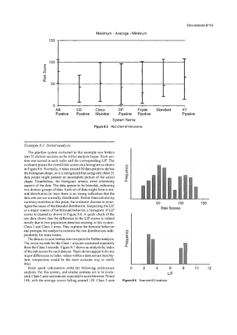
Maximum - Average - Minimum
150 fi
100
!??
8
0
Y In
E
50
AB CD Cisco DF Frijole Standard XY
Pipeline Pipeline Mainline Pipeline Pipeline Pipeline
System Name
Figure 8.5 HLC chart of risk scores.
Example 8.2: Initial analysis
The pipeline system evaluated in this example was broken
into 21 distinct sections as the initial analysis began. Each sec-
tion was scored in each index and the corresponding LIF. The
evaluator places the overall risk scores on a histogram as shown
in Figure 8.6. Normally, it takes around 30 data points to define
the histogram shape, so it is recognized that using only these 21
data points might present an incomplete picture of the actual
shape. Nonetheless, the histogram reveals some interesting
aspects of the data. The data appear to be bimodal, indicating
two distinct groups of data. Each set of data might form a nor-
mal distribution (at least there is no strong indication that the
data sets are not normally distributed). Rather than calculating
summary statistics at this point, the evaluator chooses to inves- 50 100 150
tigate the cause of the bimodal distribution. Suspecting the LZF
as a major source of the bimodal behavior, a histogram of LZF Risk Scores
scores is created as shown in Figure 8.6. A quick check of the
raw data shows that the difference in the LIF scores is indeed
mostly due to two population densities existing in this system:
Class 1 and Class 3 areas. This explains the bimodal behavior
and prompts the analyst to examine the two distributions inde-
pendently for some issues.
The data set is now broken into two parts for fixther analysis.
The seven records for the Class 1 area are examined separately
from the Class 3 records. Figure 8.7 shows an analysis by index
of the risk scores for each data set. There do not appear to be any
major differences in index values within a data set (an item-by-
item comparison would be the most accurate way to verify
this).
Some quick calculations yield the following preliminary 0 2 4 6 8 10 12
analysis: For this system, and similar systems yet to be evalu- LIF
ated, Class 1 area sections are expected to score between 70 and
140, with the average scores falling around 120. Class 3 area Figure 8.6 Example 8.2 analysis.