
Page 214 - Pipeline Risk Management Manual Ideas, Techniques, and Resources
P. 214
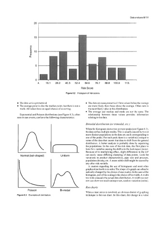
Data analyses 8/191


                         4.   16.1   28.2   40.3   52.4   64.6   76.7   88.8   100.9   113.
                                                    Risk Score
                                           Figure 8.2  Histogram of riskscores.


             The data set is symmetrical.                The data are nonsymmetrical. Data values below the average
             The average point is also the median point, but there is not a   are more likely than those above the average. Often zero is
             mode. All values have an equal chance of occurring.   the most likely value in this distribution.
                                                         The average and median and mode are not the same. The
             Exponential and Poisson distributions (see Figure 8.3), often   relationship  between  these  values  provides  information
            seen in rare events, can have the following characteristics:   relating to the data.
                                                       Bimodal distribution (or trimodal, etc.)
                                                       When the histogram shows two or more peaks (see Figure 8.3),
                                                       the data set has multiple modes. This is usually caused by two or
                                                       more distinct populations in the data set, each corresponding to
                                                       one of the peaks. For each peak there is a variable(s) unique to
                                  n
                                                       some of the data that causes that data to shift from the general
                                                       distribution.  A better analysis is probably done by separating
                                                       the populations. In the case of the risk data, the first place to
                                                       look for a variable causing the shift is in the leak impactfactor.
                                                       can easily cause differing clumping of data points. Look for
              Normal (bell-shaped)     Uniform         Because of its multiplying effect, slight differences in the LZF
                                                       variations in product characteristics, pipe size and pressure,
                                                       population density, etc.  A more subtle shift might be caused by
                                                       any other risk variable.
                                                         A caution regarding the use of histograms and most other
                                                       graphical methods is in order. The shape of a graph can often be
                                                       radically changed by the choice of axes scales. In the case of the
                                                       histogram, part ofthe scaling is the choice ofbin width.  A width
                                                       too wide conceals the actual data distribution.  A width too nar-
                                                       row can show too much unimportant, random variation (noise).

                                                       Run charts
                   Poisson             Bi-modal
                                                       When a time series is involved, an obvious choice of graphing
            Figure 8.3  Examples of distribution.      technique is the run chart. In this chart, the change in a value