
Page 237 -
P. 237
8.2 Attributes: A Helicopter View 219
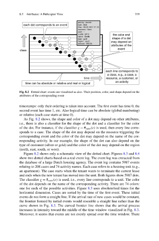
Fig. 8.2 Dotted chart: events are visualized as dots. Their position, color, and shape depend on the
attributes of the corresponding event
timestamps: only their ordering is taken into account. The first event has time 0, the
second event has time 1, etc. Also logical time can be absolute (global numbering)
or relative (each case starts at time 0).
As Fig. 8.2 shows, the shape and color of a dot may depend on other attributes,
i.e., there is also a classifier for the shape of the dot and a classifier for the color
of the dot. For instance, if the classifier e = # case (e) is used, then every line corre-
sponds to a case. The shape of the dot may depend on the resource triggering the
corresponding event and the color of the dot may depend on the name of the cor-
responding activity. In our example, the shape of the dot can also depend on the
type of customer (silver or gold) and the color of the dot may depend on the region
(north, east, south, or west).
Figure 8.2 shows only a schematic view of the dotted chart. Figures 8.3 and 8.4
show two dotted charts based on a real event log. The event log was extracted from
the database of a large Dutch housing agency. The event log contains 5987 events
relating to 208 cases and 74 activity names. Each case refers to a housing unit (e.g.,
an apartment). The case starts when the tenant wants to terminate the current lease
and ends when the new tenant has moved into the unit. Both figures show 5987 dots.
The classifier e = # case (e) is used, i.e., every line corresponds to a unit. The color
of the dot depends on the name of the corresponding activity. There are 74 colors:
one for each of the possible activities. Figure 8.3 uses absolute/real times for the
horizontal dimension. Cases are sorted by the time of the first event. These initial
events do not form a straight line. If the arrival rate of new cases would be constant,
the frontier formed by initial events would resemble a straight line rather than the
curve shown in Fig. 8.3. The curved frontier line shows that the arrival process
increases in intensity toward the middle of the time window visualized in Fig. 8.3.
Moreover, it seems that events are not evenly spread over the time window. There