
Page 238 -
P. 238
220 8 Mining Additional Perspectives
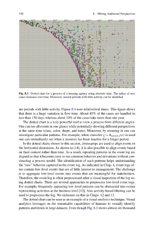
Fig. 8.3 Dotted chart for a process of a housing agency using absolute time. The influx of new
cases increases over time. Moreover, several periods with little activity can be identified
are periods with little activity. Figure 8.4 uses relative/real times. This figure shows
that there is a huge variation in flow time. About 45% of the cases are handled in
less than 150 days whereas about 10% of the cases take more than one year.
The dotted chart is a very powerful tool to view a process from different angles.
One can see all events in one glance while potentially showing different perspectives
at the same time (class, color, shape, and time). Moreover, by zooming in one can
investigate particular patterns. For example, when classifier e = # resource (e) is used
one can immediately see when a resource has been inactive for a longer period.
In the dotted charts shown in this section, timestamps are used to align events in
the horizontal dimension. As shown in [14], it is also possible to align events based
on their context rather than time. As a result, repeating patterns in the event log are
aligned so that it becomes easy to see common behavior and deviations without con-
structing a process model. The identification of such patterns helps understanding
the “raw” behavior captured in the event log. As indicated in Chap. 4, event logs of-
ten contain low-level events that are of little interest to management. The challenge
is to aggregate low-level events into events that are meaningful for stakeholders.
Therefore, the event log is often preprocessed after a visual inspection of the log us-
ing dotted charts. There are several approaches to preprocess low-level event logs.
For example, frequently appearing low-level patterns can be abstracted into events
representing activities at the business level [13]. Also activity-based filtering can be
used to preprocess the log. We elaborate on this in Chaps. 12 and 13.
The dotted chart can be seen as an example of a visual analytics technique. Visual
analytics leverages on the remarkable capabilities of humans to visually identify
patterns and trends in large datasets. Even though Fig. 8.3 shows almost six thousand