Page 18 - Six Sigma for electronics design and manufacturing
P. 18
Illustrations     Illustrations and Tables
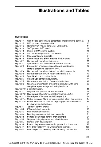
                        Figure 1.1  World-class benchmarks percentage improvements per year.  5
                        Figure 1.2  QFD product planning matrix.                13
                        Figure 1.3  Raychem CATV new connector QFD matrix.      14
                        Figure 1.4  SMT process QFD matrix.                     16
                        Figure 1.5  Use of a DFM scoring system.                18
                        Figure 1.6  Structured analysis (SA) components.        22
                        Figure 1.7  Process mapping example.                    24
                        Figure 1.8  Failure mode and effect analysis (FMEA) chart.  28
                        Figure 2.1  Conceptual view of control charts.          35
                        Figure 2.2  Specification and tolerance of a typical product.  36
                        Figure 2.3  Intersection of process capability and specification  37
                                 limits to determine the defect level.
                        Figure 2.4  Conceptual view of control and capability concepts.  38
                        Figure 2.5  Normal distribution with mean shifted by 2.5  .  40
                        Figure 2.6  Specification and control limits.           42
                        Figure 2.7  Cp and Cpk sample calculations.             44
                        Figure 2.8  Graphical presentation of normal distribution.  48
                        Figure 2.9  Graphical presentation of normal distribution with parts   53
                                 compliance percentage and multiple   limits.
                        Figure 2.10 z transformation.                           55
                        Figure 2.11 Negative and positive z transformation.     56
                        Figure 2.12 Quick visual check for normality in Example 2.4.1.  61
                        Figure 2.13 Normal plot of for data set in Example 2.4.1.  64
                        Figure 2.14 Plot of observed (dark) versus expected (clear) frequencies.  64
                        Figure 2.15 Plot of Example 2.4 data set original (top) and transformed  65
                                 by –log  x   on the bottom.
                        Figure 3.1  Types of control charts.                    71
                        Figure 3.2  X   Control chart example.                  79
                        Figure 3.3  R control chart example.                    80
                        Figure 3.4  Bonding process control chart example.      81
                        Figure 3.5  Surface cleanliness control chart example.  94
                        Figure 3.6  Shipment integrity cause and effect diagram.  96
                        Figure 3.7  Control chart flow diagram.                 96
                        Figure 3.8  Pareto diagram—% reasons for production downtime  97
                        Figure 4.1  First-time yield (FTY)  IC wire bonding example.  106
                        Figure 4.2  An example of a multistep manufacturing process line.  108


                                                                               xvii

                   Copyright 2002 The McGraw-Hill Companies, Inc.   Click Here for Terms of Use.

