
Page 129 - Statistics for Dummies
P. 129
Chapter 7: Going by the Numbers: Graphing Numerical Data
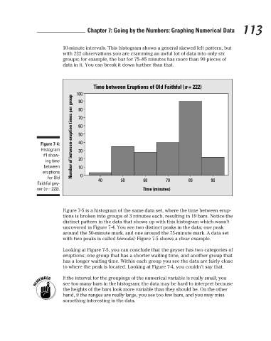
with 222 observations you are cramming an awful lot of data into only six
groups; for example, the bar for 75–85 minutes has more than 90 pieces of
data in it. You can break it down further than that.
Time between Eruptions of Old Faithful (n = 222)
100
Number of between-eruption times per group
90
80
70
60
50
40
Figure 7-4: 10-minute intervals. This histogram shows a general skewed left pattern, but 113
Histogram 30
#1 show-
ing time 20
between 10
eruptions
for Old 0 40 50 60 70 80 90
Faithful gey-
ser (n = 222). Time (minutes)
Figure 7-5 is a histogram of the same data set, where the time between erup-
tions is broken into groups of 3 minutes each, resulting in 19 bars. Notice the
distinct pattern in the data that shows up with this histogram which wasn’t
uncovered in Figure 7-4. You see two distinct peaks in the data; one peak
around the 50-minute mark, and one around the 75-minute mark. A data set
with two peaks is called bimodal; Figure 7-5 shows a clear example.
Looking at Figure 7-5, you can conclude that the geyser has two categories of
eruptions; one group that has a shorter waiting time, and another group that
has a longer waiting time. Within each group you see the data are fairly close
to where the peak is located. Looking at Figure 7-4, you couldn’t say that.
If the interval for the groupings of the numerical variable is really small, you
see too many bars in the histogram; the data may be hard to interpret because
the heights of the bars look more variable than they should be. On the other
hand, if the ranges are really large, you see too few bars, and you may miss
something interesting in the data.
3/25/11 8:16 PM
12_9780470911082-ch07.indd 113 3/25/11 8:16 PM
12_9780470911082-ch07.indd 113