
Page 130 - Statistics for Dummies
P. 130
114
Part II: Number-Crunching Basics
30
25
20
15
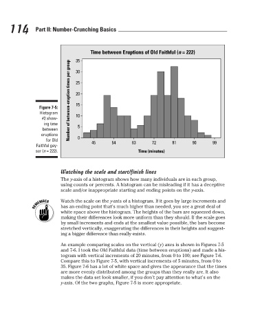
Figure 7-5:
Histogram
10
#2 show-
ing time
between
eruptions
for Old Number of between-eruption times per group 35 5 0 Time between Eruptions of Old Faithful (n = 222) 99
45
90
72
54
63
81
Faithful gey-
ser (n = 222). Time (minutes)
Watching the scale and start/finish lines
The y-axis of a histogram shows how many individuals are in each group,
using counts or percents. A histogram can be misleading if it has a deceptive
scale and/or inappropriate starting and ending points on the y-axis.
Watch the scale on the y-axis of a histogram. If it goes by large increments and
has an ending point that’s much higher than needed, you see a great deal of
white space above the histogram. The heights of the bars are squeezed down,
making their differences look more uniform than they should. If the scale goes
by small increments and ends at the smallest value possible, the bars become
stretched vertically, exaggerating the differences in their heights and suggest-
ing a bigger difference than really exists.
An example comparing scales on the vertical (y) axes is shown in Figures 7-5
and 7-6. I took the Old Faithful data (time between eruptions) and made a his-
togram with vertical increments of 20 minutes, from 0 to 100; see Figure 7-6.
Compare this to Figure 7-5, with vertical increments of 5 minutes, from 0 to
35. Figure 7-6 has a lot of white space and gives the appearance that the times
are more evenly distributed among the groups than they really are. It also
makes the data set look smaller, if you don’t pay attention to what’s on the
y-axis. Of the two graphs, Figure 7-5 is more appropriate.
3/25/11 8:16 PM
12_9780470911082-ch07.indd 114 3/25/11 8:16 PM
12_9780470911082-ch07.indd 114