
Page 135 - Statistics for Dummies
P. 135
Chapter 7: Going by the Numbers: Graphing Numerical Data
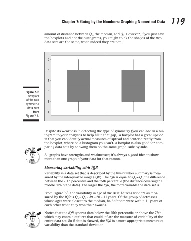
amount of distance between Q , the median, and Q . However, if you just saw
3
1
data sets are the same, when indeed they are not.
6
5
4
3
Figure 7-9:
Boxplots
of the two
2
symmetric the boxplots and not the histograms, you might think the shapes of the two 119
data sets
from 1
Figure 7-8.
Despite its weakness in detecting the type of symmetry (you can add in a his-
togram to your analyses to help fill in that gap), a boxplot has a great upside
in that you can identify actual measures of spread and center directly from
the boxplot, where on a histogram you can’t. A boxplot is also good for com-
paring data sets by showing them on the same graph, side by side.
All graphs have strengths and weaknesses; it’s always a good idea to show
more than one graph of your data for that reason.
Measuring variability with IQR
Variability in a data set that is described by the five-number summary is mea-
sured by the interquartile range (IQR). The IQR is equal to Q – Q , the difference
3 1
between the 75th percentile and the 25th percentile (the distance covering the
middle 50% of the data). The larger the IQR, the more variable the data set is.
From Figure 7-3, the variability in age of the Best Actress winners as mea-
sured by the IQR is Q – Q = 39 – 28 = 11 years. Of the group of actresses
3 1
whose ages were closest to the median, half of them were within 11 years of
each other when they won their awards.
Notice that the IQR ignores data below the 25th percentile or above the 75th,
which may contain outliers that could inflate the measure of variability of the
entire data set. So if data is skewed, the IQR is a more appropriate measure of
variability than the standard deviation.
3/25/11 8:16 PM
12_9780470911082-ch07.indd 119
12_9780470911082-ch07.indd 119 3/25/11 8:16 PM