
Page 140 - Statistics for Dummies
P. 140
124
Part II: Number-Crunching Basics
100
90
80
70
60
Age
50
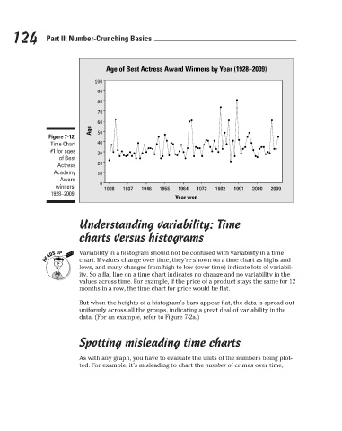
Figure 7-12:
40
Time Chart
#1 for ages
30
of Best
20
Actress
Academy
10
Award
0 Age of Best Actress Award Winners by Year (1928–2009)
winners,
1928 1937 1946 1955 1964 1973 1982 1991 2000 2009
1928–2009.
Year won
Understanding variability: Time
charts versus histograms
Variability in a histogram should not be confused with variability in a time
chart. If values change over time, they’re shown on a time chart as highs and
lows, and many changes from high to low (over time) indicate lots of variabil-
ity. So a flat line on a time chart indicates no change and no variability in the
values across time. For example, if the price of a product stays the same for 12
months in a row, the time chart for price would be flat.
But when the heights of a histogram’s bars appear flat, the data is spread out
uniformly across all the groups, indicating a great deal of variability in the
data. (For an example, refer to Figure 7-2a.)
Spotting misleading time charts
As with any graph, you have to evaluate the units of the numbers being plot-
ted. For example, it’s misleading to chart the number of crimes over time,
3/25/11 8:16 PM
12_9780470911082-ch07.indd 124 3/25/11 8:16 PM
12_9780470911082-ch07.indd 124