
Page 141 - Statistics for Dummies
P. 141
Chapter 7: Going by the Numbers: Graphing Numerical Data
rather than the crime rate (crimes per capita) — because the population size
of a city changes over time, crime rate is the appropriate measure. Make sure
you understand what numbers are being graphed and examine them for fair-
ness and appropriateness.
Watching the scale and start/end points
The scale on the vertical axis can make a big difference in the way the time
chart looks. Refer to Figure 7-12 to see my original time chart of the ages for
the Best Actress Academy Award winners from 1928–2009 in increments of
10 years. You see a fair amount of variability, as discussed previously.
In Figure 7-12, the starting and ending points on the vertical axis are 0 to 100,
which creates a little bit of extra white space on the top and bottom of the
picture. I could have used 10 and 90 as my start/end points, but this graph
looks reasonable.
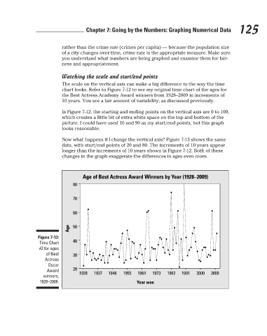
Now what happens if I change the vertical axis? Figure 7-13 shows the same
data, with start/end points of 20 and 80. The increments of 10 years appear 125
longer than the increments of 10 years shown in Figure 7-12. Both of these
changes in the graph exaggerate the differences in ages even more.
Age of Best Actress Award Winners by Year (1928–2009)
80
70
60
Age 50
Figure 7-13:
40
Time Chart
#2 for ages
of Best 30
Actress
Oscar
20
Award
1928 1937 1946 1955 1964 1973 1982 1991 2000 2009
winners,
1928–2009. Year won
3/25/11 8:16 PM
12_9780470911082-ch07.indd 125 3/25/11 8:16 PM
12_9780470911082-ch07.indd 125