
Page 142 - Statistics for Dummies
P. 142
126
Part II: Number-Crunching Basics
How do you decide which graph is the best one for your data? There is no per-
fect graph; there is no right or wrong answer; but there are limits. You can
quickly spot problems just by zooming in on the scale and start/end points.
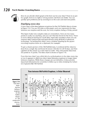
Simplifying excess data
A time chart of the time between eruptions for the Old Faithful data is shown
in Figure 7-14. You see 222 dots on this graph; each one represents the time
between one eruption and the next, for every eruption during a 16-day period.
This figure looks very complex; data are everywhere, there are too many
points to really see anything, and you can’t find the forest for the trees. There
is such a thing as having too much data, especially nowadays when you can
measure data continuously and meticulously using all kinds of advanced
technology. I’m betting they didn’t have a student standing by the geyser
recording eruption times on a clipboard, for example!
To get a clearer picture of the Old Faithful data, I combined all the observa-
tions from a single day and found its mean; I did this for all 16 days, and then
I plotted all the means on a time chart in order. This reduced the data from
222 points to 16 points. The time chart is shown in Figure 7-15.
From this time chart I see a little bit of a cyclical pattern to the data; every day
or two it appears to shift from short times between eruptions to longer times
between eruptions. While these changes are not definitive, it does provide
important information for scientists to follow up on when studying the behav-
ior of geysers like Old Faithful.
Time between Old Faithful Eruptions, in Order Observed
100
90
Figure 7-14:
Time chart 80
show-
ing time Time (minutes) 70
between
eruptions 60
for Old
Faithful
Geyser 50
(n = 222
consecutive 40
observa- 1 22 44 66 88 110 132 154 176 198 220
tions). Observation number
3/25/11 8:16 PM
12_9780470911082-ch07.indd 126 3/25/11 8:16 PM
12_9780470911082-ch07.indd 126