
Page 143 - Statistics for Dummies
P. 143
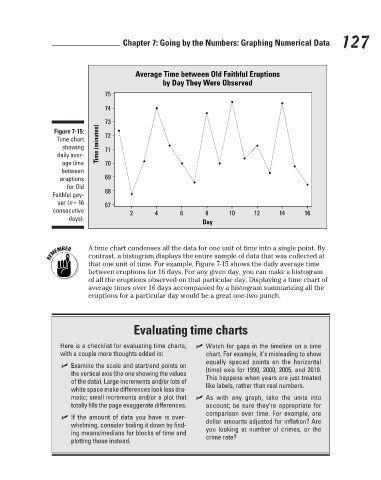
Average Time between Old Faithful Eruptions
                                                                        by Day They Were Observed
                                                        74
                                                        73
                                          Figure 7-15:
                                                        72
                                           Time chart
                                            showing
                                                        71
                                           daily aver-
                                            age time
                                                        70
                                            between
                                                        69
                                            eruptions
                                              for Old
                                                        68
                                          Faithful gey-
                                           ser (n = 16   Time (minutes)  75   Chapter 7: Going by the Numbers: Graphing Numerical Data  127
                                                        67
                                          consecutive
                                                               2      4      6      8      10     12     14     16
                                              days).                               Day

                                                    A time chart condenses all the data for one unit of time into a single point. By
                                                    contrast, a histogram displays the entire sample of data that was collected at
                                                    that one unit of time. For example, Figure 7-15 shows the daily average time
                                                    between eruptions for 16 days. For any given day, you can make a histogram
                                                    of all the eruptions observed on that particular day. Displaying a time chart of
                                                    average times over 16 days accompanied by a histogram summarizing all the
                                                    eruptions for a particular day would be a great one-two punch.
                                                                Evaluating time charts
                                            Here is a checklist for evaluating time charts,    ✓ Watch for gaps in the timeline on a time
                                            with a couple more thoughts added in:   chart. For example, it’s misleading to show
                                                                                    equally spaced points on the horizontal
                                             ✓ Examine the scale and start/end points on
                                               the vertical axis (the one showing the values   (time) axis for 1990, 2000, 2005, and 2010.
                                               of the data). Large increments and/or lots of   This happens when years are just treated
                                               white space make differences look less dra-  like labels, rather than real numbers.
                                               matic; small increments and/or a plot that    ✓ As with any graph, take the units into
                                               totally fills the page exaggerate differences.  account; be sure they’re appropriate for
                                                                                    comparison over time. For example, are
                                             ✓ If the amount of data you have is over-
                                               whelming, consider boiling it down by find-  dollar amounts adjusted for inflation? Are
                                               ing means/medians for blocks of time and   you looking at number of crimes, or the
                                               plotting those instead.              crime rate?


                                                                                                                           3/25/11   8:16 PM
                             12_9780470911082-ch07.indd   127
                             12_9780470911082-ch07.indd   127                                                              3/25/11   8:16 PM