
Page 139 - Statistics for Dummies
P. 139
Chapter 7: Going by the Numbers: Graphing Numerical Data
Tackling Time Charts
A time chart (also called a line graph) is a data display used to examine trends
in data over time (also known as time series data). Time charts show time on
the x-axis (for example, by month, year, or day) and the values of the variable
being measured on the y-axis (like birth rates, total sales, or population size).
Each point on the time chart summarizes all the data collected at that par-
ticular time; for example, the average of all pepper prices for January or the
total revenue for 2010.
Interpreting time charts
To interpret a time chart, look for patterns and trends as you move across the
chart from left to right.
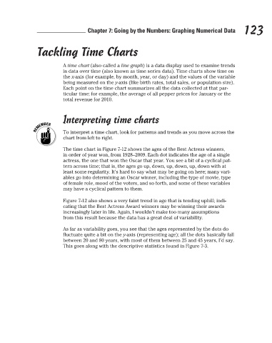
The time chart in Figure 7-12 shows the ages of the Best Actress winners, 123
in order of year won, from 1928–2009. Each dot indicates the age of a single
actress, the one that won the Oscar that year. You see a bit of a cyclical pat-
tern across time; that is, the ages go up, down, up, down, up, down with at
least some regularity. It’s hard to say what may be going on here; many vari-
ables go into determining an Oscar winner, including the type of movie, type
of female role, mood of the voters, and so forth, and some of these variables
may have a cyclical pattern to them.
Figure 7-12 also shows a very faint trend in age that is tending uphill; indi-
cating that the Best Actress Award winners may be winning their awards
increasingly later in life. Again, I wouldn’t make too many assumptions
from this result because the data has a great deal of variability.
As far as variability goes, you see that the ages represented by the dots do
fluctuate quite a bit on the y-axis (representing age); all the dots basically fall
between 20 and 80 years, with most of them between 25 and 45 years, I’d say.
This goes along with the descriptive statistics found in Figure 7-3.
3/25/11 8:16 PM
12_9780470911082-ch07.indd 123 3/25/11 8:16 PM
12_9780470911082-ch07.indd 123