Page 286 - The Creative Training Idea Book Inspired Tips and Techniques for Engaging and Effective Learning
P. 286
lucas chap 08  11/20/02  12:49 PM  Page 275


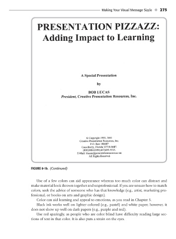
                                FIGURE 8-1b. (Continued)               Making Your Visual Message Sizzle   275


                                   Use of a few colors can aid appearance whereas too much color can distract and
                                make material look thrown together and unprofessional. If you are unsure how to match
                                colors, seek the advice of someone who has that knowledge (e.g., artist, marketing pro-
                                fessional, or books on arts and graphic design).
                                   Color can aid learning and appeal to emotions, as you read in Chapter 5.
                                   Black ink works well on lighter colored (e.g., pastel) and white paper; however, it
                                does not show up well on dark papers (e.g., purple and red).
                                   Use red sparingly, as people who are color blind have difficulty reading large sec-
                                tions of text in that color. It is also puts a strain on the eyes.

