
Page 78 - Applied Statistics Using SPSS, STATISTICA, MATLAB and R
P. 78
2.2 Presenting the Data 57
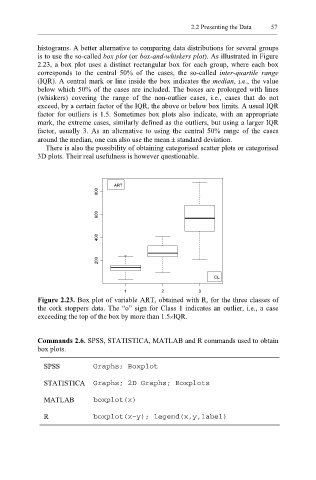
histograms. A better alternative to comparing data distributions for several groups
is to use the so-called box plot (or box-and-whiskers plot). As illustrated in Figure
2.23, a box plot uses a distinct rectangular box for each group, where each box
corresponds to the central 50% of the cases, the so-called inter-quartile range
(IQR). A central mark or line inside the box indicates the median, i.e., the value
below which 50% of the cases are included. The boxes are prolonged with lines
(whiskers) covering the range of the non-outlier cases, i.e., cases that do not
exceed, by a certain factor of the IQR, the above or below box limits. A usual IQR
factor for outliers is 1.5. Sometimes box plots also indicate, with an appropriate
mark, the extreme cases, similarly defined as the outliers, but using a larger IQR
factor, usually 3. As an alternative to using the central 50% range of the cases
around the median, one can also use the mean ± standard deviation.
There is also the possibility of obtaining categorised scatter plots or categorised
3D plots. Their real usefulness is however questionable.
ART
800
600
400
200
CL
1 2 3
Figure 2.23. Box plot of variable ART, obtained with R, for the three classes of
the cork stoppers data. The “o” sign for Class 1 indicates an outlier, i.e., a case
exceeding the top of the box by more than 1.5×IQR.
Commands 2.6. SPSS, STATISTICA, MATLAB and R commands used to obtain
box plots.
SPSS Graphs; Boxplot
STATISTICA Graphs; 2D Graphs; Boxplots
MATLAB boxplot(x)
R boxplot(x~y); legend(x,y,label)