
Page 77 - Applied Statistics Using SPSS, STATISTICA, MATLAB and R
P. 77
56 2 Presenting and Summarising the Data
plot is often not so easy to interpret (as in Figure 2.21); therefore, in normal
practice, one often inspects multivariate data graphically through scatter plots of
the variables grouped in pairs.
Besides scatter plots and 3D plots, it may be convenient to inspect bivariate
histograms or bar plots (such as the one shown in Figure A.1, Appendix A).
STATISTICA affords the possibility of obtaining such bivariate histograms from
within the Fre quency Tables window of the Descri ptive Statistics
menu.
2.2.4 Categorised Plots
Statistical studies often address the problem of comparing random distributions of
the same variables for different values of an extra grouping variable. For instance,
in the case of the cork stopper dataset, one might be interested in comparing
numbers of defects for the three different groups (or classes) of the cork stoppers.
The cork stopper dataset, described in Appendix E, is an example of a grouped (or
classified) dataset. When dealing with grouped data one needs to compare the data
across the groups. For that purpose there is a multitude of graphic tools, known as
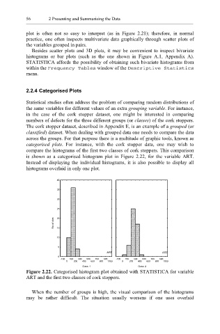
categorised plots. For instance, with the cork stopper data, one may wish to
compare the histograms of the first two classes of cork stoppers. This comparison
is shown as a categorised histogram plot in Figure 2.22, for the variable ART.
Instead of displaying the individual histograms, it is also possible to display all
histograms overlaid in only one plot.
40
35
30
25
No of obs 20
15
10
5
ART ART
0
-100 100 300 500 700 900 -100 100 300 500 700 900
0 200 400 600 800 1000 0 200 400 600 800 1000
Class: 1 Class: 2
Figure 2.22. Categorised histogram plot obtained with STATISTICA for variable
ART and the first two classes of cork stoppers.
When the number of groups is high, the visual comparison of the histograms
may be rather difficult. The situation usually worsens if one uses overlaid