
Page 89 -
P. 89
HAN 09-ch02-039-082-9780123814791
52 Chapter 2 Getting to Know Your Data 2011/6/1 3:15 Page 52 #14
to assess both the overall behavior and unusual occurrences). Second, it plots quantile
information (see Section 2.2.2). Let x i , for i = 1 to N, be the data sorted in increasing
order so that x 1 is the smallest observation and x N is the largest for some ordinal or
numeric attribute X. Each observation, x i , is paired with a percentage, f i , which indicates
that approximately f i × 100% of the data are below the value, x i . We say “approximately”
because there may not be a value with exactly a fraction, f i , of the data below x i . Note
that the 0.25 percentile corresponds to quartile Q 1 , the 0.50 percentile is the median,
and the 0.75 percentile is Q 3 .
Let
i − 0.5
f i = . (2.7)
N
1
These numbers increase in equal steps of 1/N, ranging from 2N (which is slightly
above 0) to 1 − 1 (which is slightly below 1). On a quantile plot, x i is graphed against
2N
f i . This allows us to compare different distributions based on their quantiles. For exam-
ple, given the quantile plots of sales data for two different time periods, we can compare
their Q 1 , median, Q 3 , and other f i values at a glance.
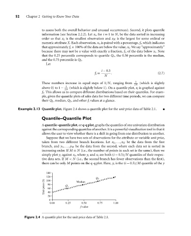
Example 2.13 Quantile plot. Figure 2.4 shows a quantile plot for the unit price data of Table 2.1.
Quantile–Quantile Plot
A quantile–quantile plot, or q-q plot, graphs the quantiles of one univariate distribution
against the corresponding quantiles of another. It is a powerful visualization tool in that it
allows the user to view whether there is a shift in going from one distribution to another.
Suppose that we have two sets of observations for the attribute or variable unit price,
taken from two different branch locations. Let x 1 ,...,x N be the data from the first
branch, and y 1 ,...,y M be the data from the second, where each data set is sorted in
increasing order. If M = N (i.e., the number of points in each set is the same), then we
simply plot y i against x i , where y i and x i are both (i − 0.5)/N quantiles of their respec-
tive data sets. If M < N (i.e., the second branch has fewer observations than the first),
there can be only M points on the q-q plot. Here, y i is the (i − 0.5)/M quantile of the y
140
120
Q 3
Unit price ($) 80 Q 1
100
Median
60
40
20
0
0.00 0.25 0.50 0.75 1.00
f-value
Figure 2.4 A quantile plot for the unit price data of Table 2.1.