
Page 93 -
P. 93
HAN 09-ch02-039-082-9780123814791
56 Chapter 2 Getting to Know Your Data 2011/6/1 3:15 Page 56 #18
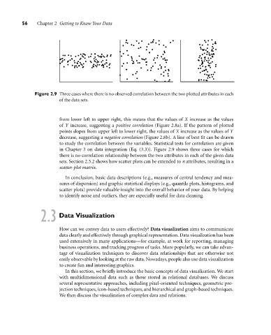
Figure 2.9 Three cases where there is no observed correlation between the two plotted attributes in each
of the data sets.
from lower left to upper right, this means that the values of X increase as the values
of Y increase, suggesting a positive correlation (Figure 2.8a). If the pattern of plotted
points slopes from upper left to lower right, the values of X increase as the values of Y
decrease, suggesting a negative correlation (Figure 2.8b). A line of best fit can be drawn
to study the correlation between the variables. Statistical tests for correlation are given
in Chapter 3 on data integration (Eq. (3.3)). Figure 2.9 shows three cases for which
there is no correlation relationship between the two attributes in each of the given data
sets. Section 2.3.2 shows how scatter plots can be extended to n attributes, resulting in a
scatter-plot matrix.
In conclusion, basic data descriptions (e.g., measures of central tendency and mea-
sures of dispersion) and graphic statistical displays (e.g., quantile plots, histograms, and
scatter plots) provide valuable insight into the overall behavior of your data. By helping
to identify noise and outliers, they are especially useful for data cleaning.
2.3 Data Visualization
How can we convey data to users effectively? Data visualization aims to communicate
data clearly and effectively through graphical representation. Data visualization has been
used extensively in many applications—for example, at work for reporting, managing
business operations, and tracking progress of tasks. More popularly, we can take advan-
tage of visualization techniques to discover data relationships that are otherwise not
easily observable by looking at the raw data. Nowadays, people also use data visualization
to create fun and interesting graphics.
In this section, we briefly introduce the basic concepts of data visualization. We start
with multidimensional data such as those stored in relational databases. We discuss
several representative approaches, including pixel-oriented techniques, geometric pro-
jection techniques, icon-based techniques, and hierarchical and graph-based techniques.
We then discuss the visualization of complex data and relations.